The Study Hub
Redesigning Quizlet's navigation, onboarding, and organization system to turn a bundle of standalone study tools into one course-centered place students go to study, across web, iOS, and Android.
Company
Quizlet
Platforms
Web, iOS, Android
Lead Designer
Role
~20 cross-functional
Team size (peak)
Overview
Turning five products into one mental model
Quizlet had flashcard creation, study modes, expert solutions, and practice tests. Each was strong on its own. None of it felt like one product. Students didn't think of Quizlet as a place to study. They thought of it as a place to make flashcards, or a place to find answers, depending on which door they walked in through.
The Study Hub team set out to change that. The goal wasn't another cross-promotion banner. It was to redesign the product so that every entry point made the full suite obvious, every piece of content lived somewhere organized by course, and the system got smarter about what a student needed next.
5
Content types unified in one system
1,200+
Colleges with full explicit course coverage
+243%
Lift in explicit course adds
4
Major surfaces redesigned
Context & Problem
Quizlet was shipping the org chart, not a product
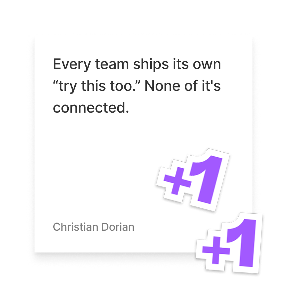
Before Study Hub, Quizlet's bridging tactics were mostly marketing placements: banners, "try this" cards, upsell modals. Product teams built one-off bridges between features, but nobody was incentivized to build a cohesive hub. The org chart shipped before the experience did.
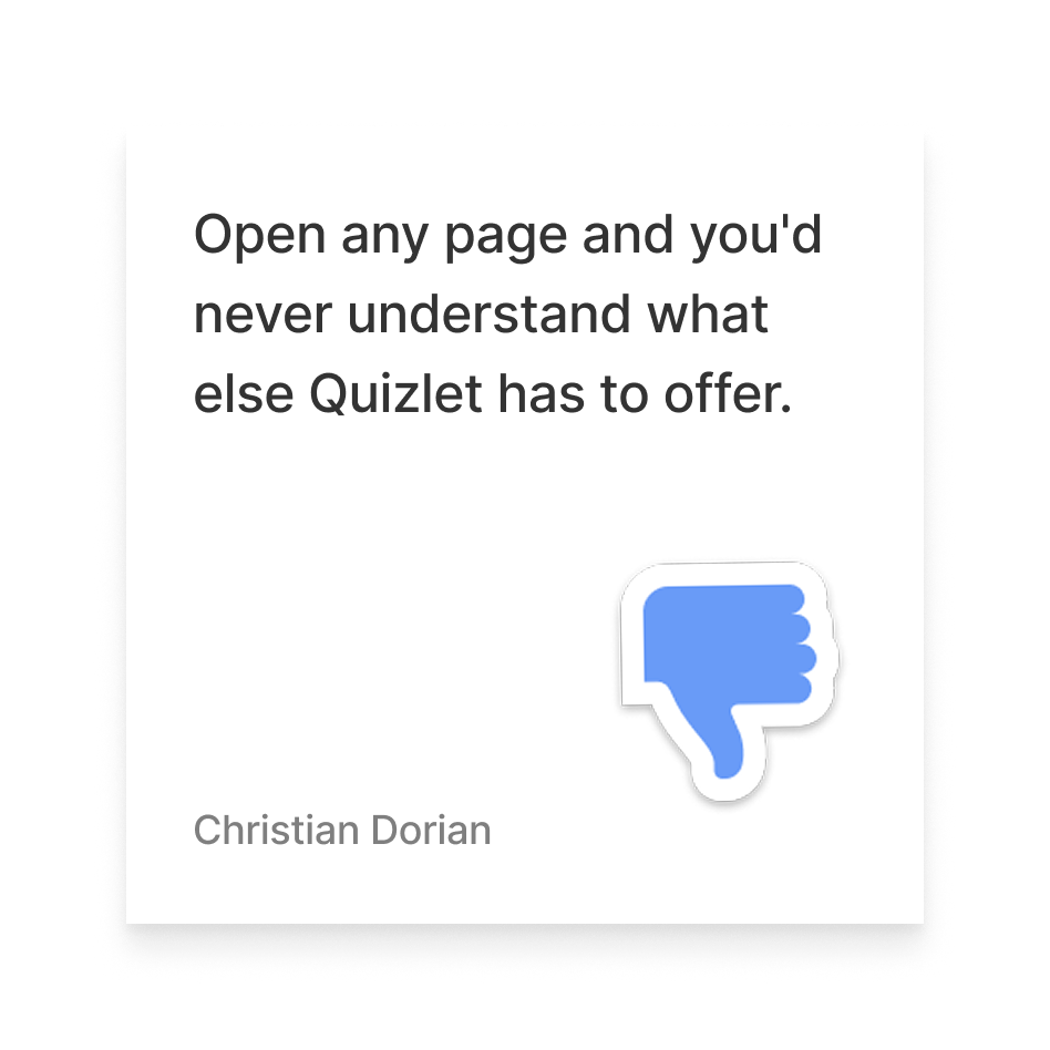
The mental model we were trying to move students away from: Quizlet is flashcards. Quizlet is study modes. Quizlet is expert solutions. Quizlet is practice tests. The mental model we wanted instead: Quizlet is where I go to study.
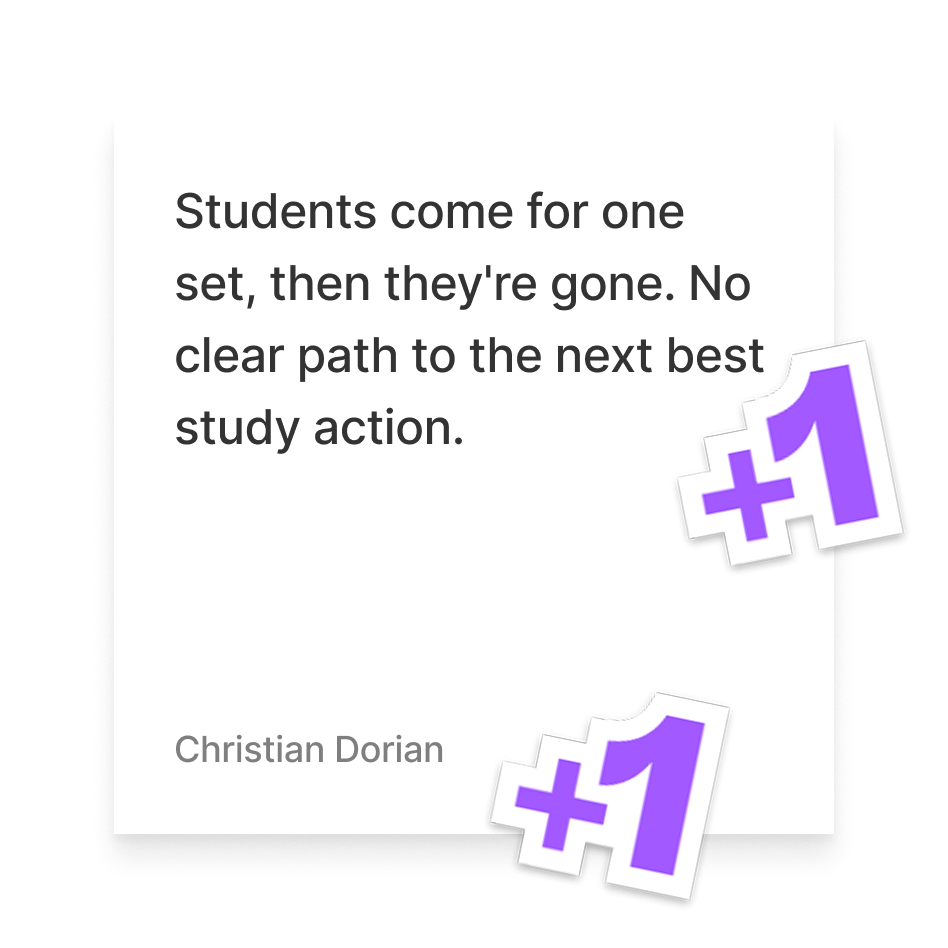
Key pain points
Approach
A year of parallel workstreams
Leadership set the high-level strategy: make Quizlet a cohesive study hub, not a bundle of siloed tools. I gave feedback as that direction took shape, but the strategy came from leadership. Once it was set, I used frameworks like Jobs to Be Done to define the problems we were solving, then diverged on a wide range of solutions before converging on the ones we'd build. Some projects were assumed from the outset, like global navigation; others, like the saving flow and Your Library redesign, I identified and scoped myself.
From there, I partnered with PM to build an execution roadmap and led design across every project, working with engineering on scope. We shipped in phases rather than all at once: navigation came first to give the rest of the experience a consistent frame, then later work ran in parallel as capacity allowed. We also fixed the data underneath it: course data went from partial coverage of 2,500 colleges with heavy implicit-match fallback to full explicit coverage at 1,200+ colleges.
Rollout sequencing
1
Global navigation redesign, web, iOS, and Android
2
Course folders: creation, onboarding, tagging, and saving, built in parallel across all three platforms
3
Later parallel workstreams: Your Library redesign, Home redesign, and folder recommendations
Design Work ∙ Global Navigation
Making the whole product visible from anywhere
The global nav had to work well across a range of screens and user states: light and dark mode, free and Plus-upgrade variants, collapsed and expanded side nav, and mobile equivalents for iOS and Android. Every state needed to hold up whether a student was signed in or logged out, on a free account or Plus, on a laptop or switching between apps on their phone. iOS, Android, and Web each needed their own solution that felt native to its platform, while still feeling harmonious for students moving between them.
Redesigning navigation isn't about a new menu. It's about letting students move seamlessly across a whole suite of tools, no matter which screen they start from.
Design Work ∙ Course Confirmation & Onboarding
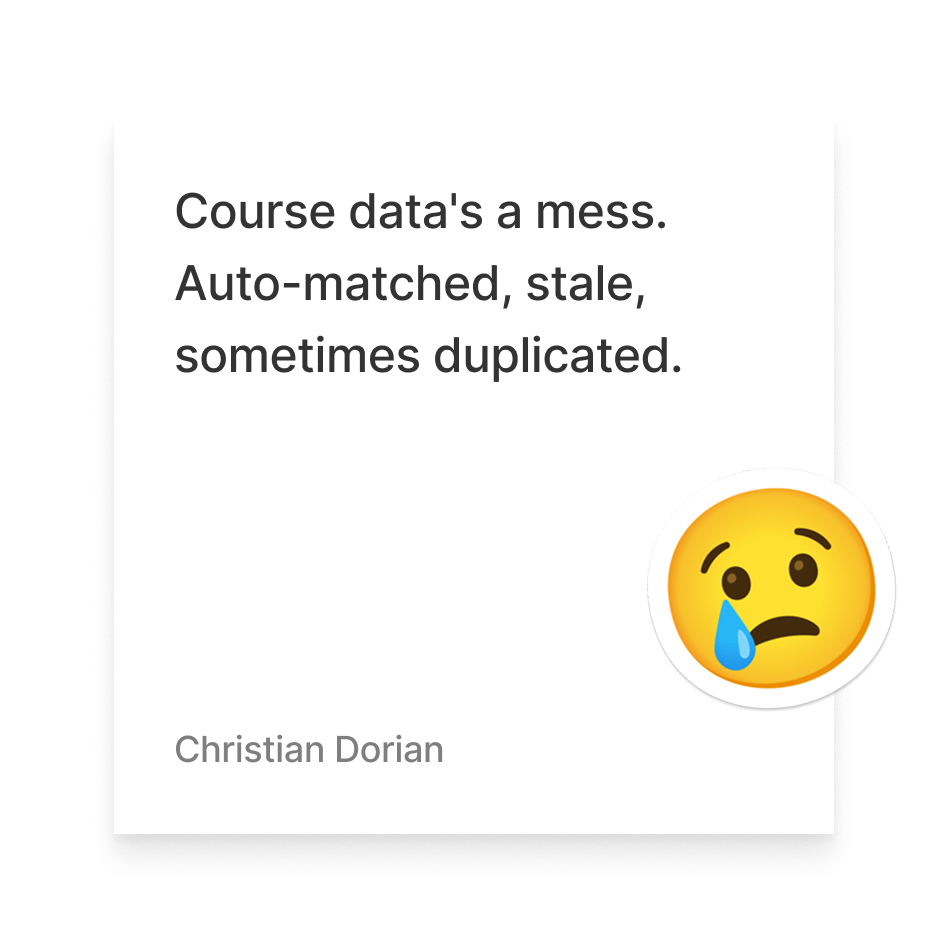
Before this work, course matching leaned heavily on implicit, auto-suggested courses. Many were stale, duplicated, or simply wrong. We redesigned onboarding to prioritize explicit course selection. When we didn't have coverage for a student's school or course, we let them add a custom name instead, giving them a fallback path in the moment.
Getting every student into the right course, fast
That custom entry never became canonical data in our system, but it gave us a real signal for exactly where our school and course coverage had gaps. The flow confirms school first, then course. We used location to power recommendations, prioritizing nearby colleges and universities, alongside clear handling for edge cases: no match found, adding a new school, or correcting a mismatched suggestion.
Course types

Explicit
MCEN 3012 Section 2, Thermodynamics @ CU Boulder

Implicit
Biology and Society @ CU Boulder (used as fallback)
Design Work ∙ Course Folders & Tagging
A folder for every course, flexible enough for any goal
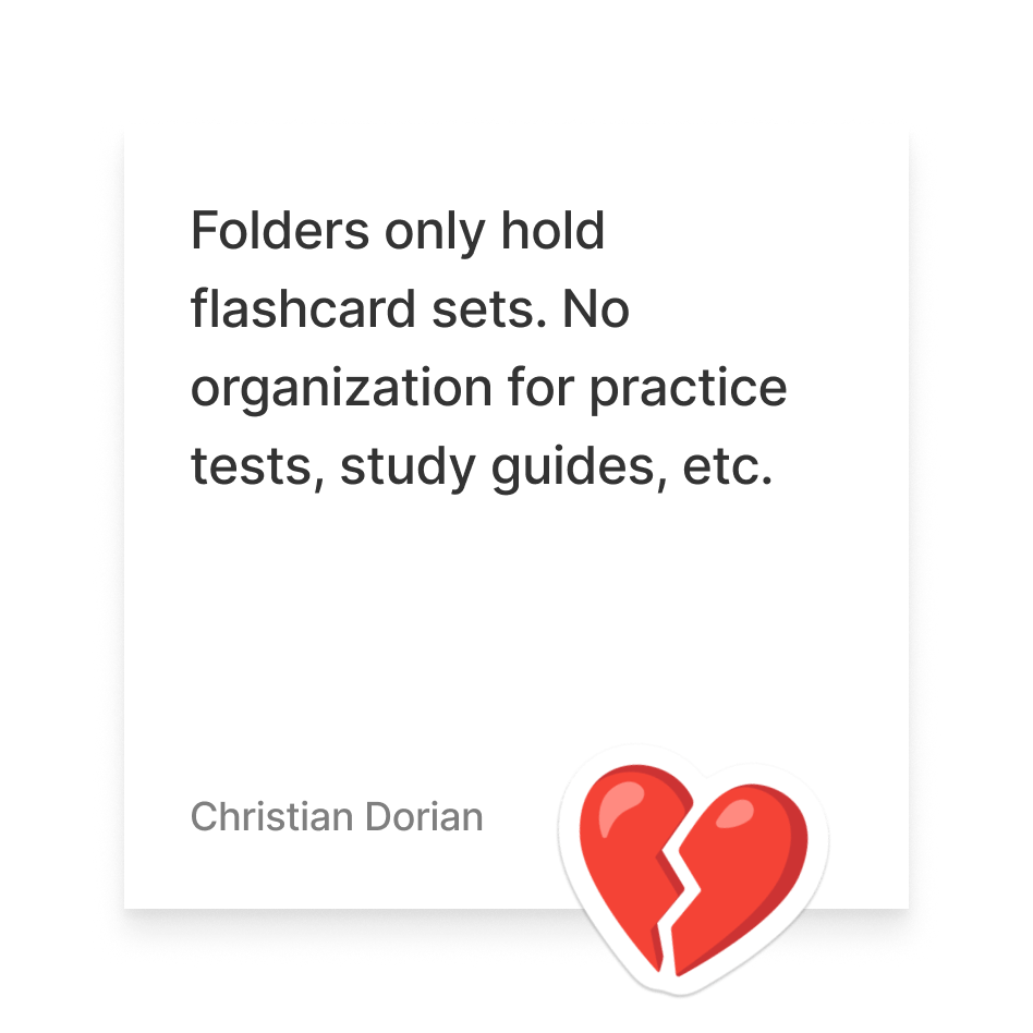
New students automatically get a course folder for every class they add during onboarding, and we reuse that same flow each semester to add new courses. It's a deliberate default: most students won't organize on their own, so we build the folders for them and point them to the side nav. Folders hold every content type: flashcard sets, Magic Notes, practice tests, and expert solutions, not just flashcards like before.
Inside a folder, students add tags for sub-organization tied to specific goals, like Exam 1, Midterm, and Final Exam for a BIO 110 folder. We also designed due dates for tags, so a tag could double as a deadline, and a syllabus upload that would auto-generate those tags from a course's real assignments, though neither shipped. Eventually, that structure could have powered a study plan view inside the folder. We didn't get that far.
A folder wasn't just a container anymore. It was a space on Quizlet you'd go to that had full context on your course and your study goals.
Design Work ∙ Saving Flow
Saving helps keep students organized, while training the system
We redesigned the save flow across every content type so saving to a course folder became the default, not an afterthought. Saving a Magic Note, a set, or a practice test now prompts the student to confirm the right folder, widening the entry points into that organized space, and students can progressively tag material to their own goals rather than organizing everything upfront. Each save is also a signal: the more students save into a folder, the better we can surface what's worth studying to the next student who lands there.
Design Work ∙ Your Library
Modernizing how students browse everything they've saved or created.
Your Library already supported every content type: flashcard sets, study guides, practice tests, and solutions. The problem was discoverability: content was buried across separate tabs, making it cumbersome to find what you'd already saved. We replaced that tabbed structure with a single filterable feed, upgraded sort and search, and simplified list and empty states for both light and dark mode.
Design Work ∙ Folder Study Experience
Folders shouldn't be a dead end. They should be a way in
We optimized the flow into studying from a folder, and let students study not just at the folder level but at the tag level, so they could prepare for a specific goal, like material saved to "Exam 1." Studying also became the natural next step after adding content to a folder, not just one of several options you'd see there.
Impact
What Assembly made possible
Rebrands that once took months of manual effort could be propagated in days. New features were built on a shared foundation rather than reinventing patterns each time. Handoff became more predictable. And designers could drive token changes to production across all three platforms with engineers staying in the loop for review.
A 2025 survey of 26 cross-functional team members gave Assembly a 4/5 on efficiency and 4/5 on both component discoverability in Figma and confidence in selecting the right token. 73% used the system regularly and 77% wanted to contribute back to it.
Tooling & process highlights

Assembly Figma library: anatomy diagrams, size variants, interaction states, and do/don't guidance built directly into every component

Storybook integration: component pages link directly to live Storybook stories for engineering reference

Code Connect + Dev Mode: engineers inspect real component props in Figma without asking designers

Token pipeline: JSON export from Figma to GitHub PR to multi-platform production

LinkedIn Learning course: self-paced Figma + Assembly onboarding for engineers

Assembly Slack channels: component announcements, best practices, and real-time troubleshooting across design and engineering
Key outcomes
Full token system shipped across ref, sys, and comp layers on web, iOS, and Android
Complete Assembly Figma library with anatomy docs, variants, and Storybook links across all three platforms
Full foundation layer: icon library, illustration system, type scale, color system, and avatar component
Figma became the #1 documentation destination; Storybook a close second among engineers
Two product rebrands shipped at scale with significantly reduced manual effort
Designer-driven token pipeline: color changes driven by design, reviewed and shipped with engineering
77% of survey respondents interested in contributing to Assembly
Reflection
What I'd do differently
Leading the Assembly team while also leading design on another product team meant I was always context switching. The system moved forward but some strategic documentation fell through the cracks. More dedicated focus earlier would have helped the team scale ownership faster.
The 2025 survey flagged two known gaps: Figma-to-code parity scored 3.3/5 and ease of implementing designs in code scored 3.4/5. Both would have been the next chapter of the work. The LinkedIn Learning course was the right idea but needed more internal champions to drive adoption.