Rethinking Set Study
Vibe-coding a redesign of Quizlet's set page, the single highest-traffic surface in the product, from a flashcard-first layout into one organized around what students actually came to do.
Quizlet
Company
Lead Designer
Role
Web
Platform
2 Designers, 1 PM, 3 Engineers
Team size (peak)
A high-traffic page that had outgrown its job
Overview
The Quizlet "set page," the landing page a learner hits when opening a flashcard set, hadn't been rethought in years, despite being the product's highest-traffic surface. It treated every visitor identically, ignoring ownership, familiarity, and return behavior, and answered none of learners' core questions: Is this relevant? How do I start? Where do I go if it's not? It had become a destination when its job was to be an entryway.
I led design on a project to rebuild the page around what learners actually come to do, not a one-size-fits-all layout. Over two months we ran a design sprint, diverged across five concepts, narrowed to three, and validated a direction through research before scoping A/B tests. The project was shelved early in the year when another initiative was prioritized for back-to-school season, before any test shipped.
5
directions vibe-coded
end to end in Cursor
100%
of testing used real
student content
3
A/B hypotheses scoped
and ready to launch
The page was a destination, not an entryway
Context & Problem
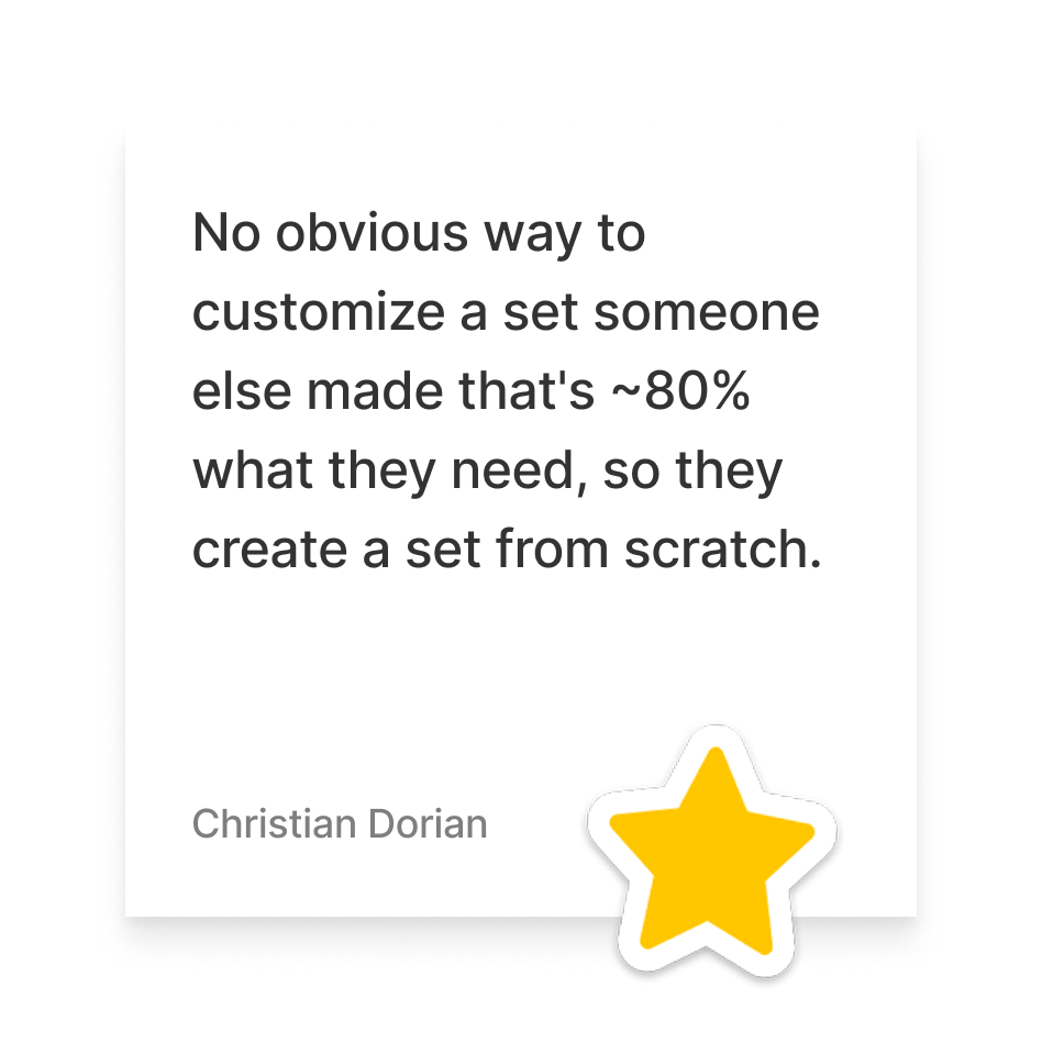
Learners land on a set page with a short list of simple questions: Is this relevant to what I need to study? If yes, how do I start quickly? If no, how do I find or create something better? The page wasn't answering any of these clearly, treating every visitor identically: creator or not, first-timer or returner, occasional user or daily studier.
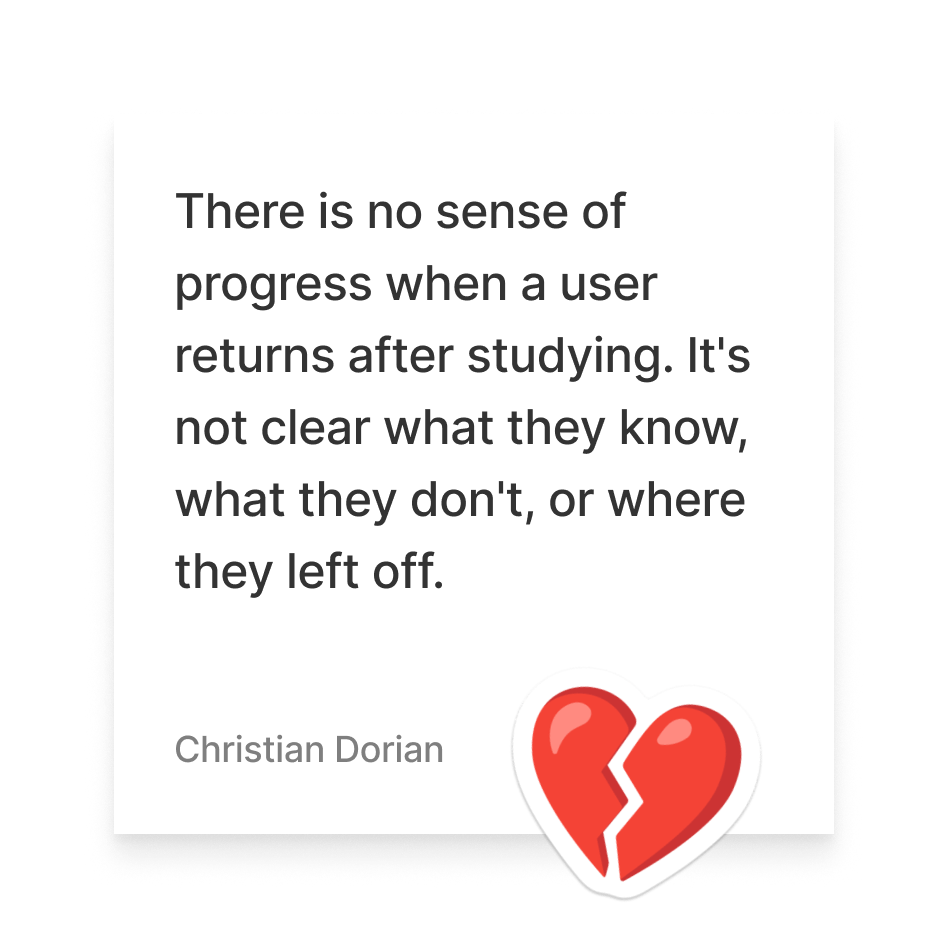
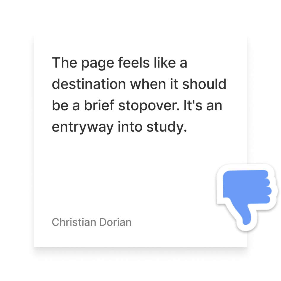
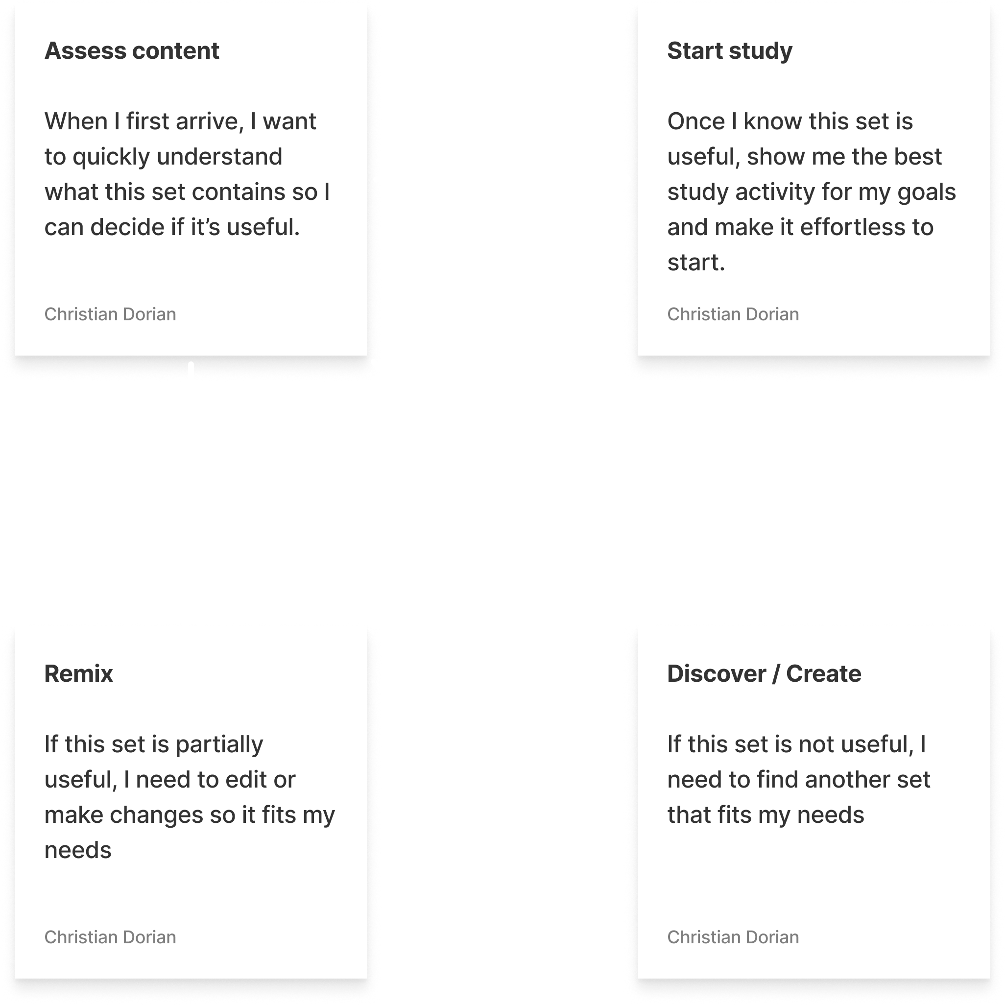
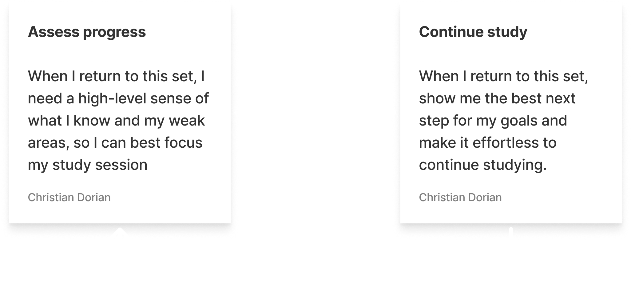
The page ignored nearly every signal it had access to, whether someone had created the set, studied it before, or was returning for the fifth time versus the first, drifting into a destination rather than the brief stopover it was meant to be. These pain points came out of problem-space discovery at our Denver kickoff, where we also mapped the core jobs learners needed to do across first-time and return visits.
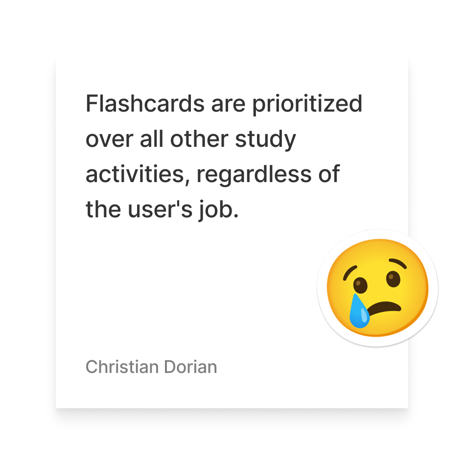
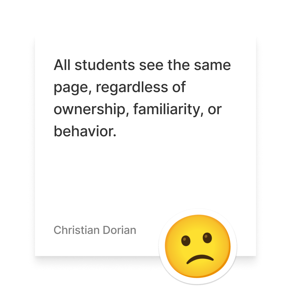
Key Pain Points
Core User Jobs
1st visit
2nd visit
A design sprint, then deliberate divergence
Approach
We ran the project roughly like a design sprint, moving through discover, define, develop, and deliver, though we intentionally diverged more than we converged in the develop phase to maximize the range of directions we considered before committing engineering time.

Phase 1
Kickoff
The team, myself, a second designer, and our PM, spent three days aligning on problem space, user jobs, and business goals
Mapped jobs for first-time visits (assess, start study) and return visits (assess progress, continue study)
Ran crazy-8s, pitched, dot-voted, and weighed pros/cons/reach before picking directions to prototype

Phase 2
Divergence
Switched into building: vibe-coded prototypes with Cursor
Used Figma for quick mockups and the Assembly design system, pulling tokens and pasting components via Figma MCP, to move fast
Produced five distinct directions: Preview, 3 Panel, 3 Panel + AI, List, Journey

Phase 3
Convergence
Internal review cut five concepts to three, each with an explicit hypothesis and user-job mapping
A researcher owned the qual research plan and synthesis; I collaborated on the plan and sat in on interviews
Findings pointed clearly toward one direction
Pulled in eng team to scope initial set of A/B tests to pair qualitative research with quantitative data
Five directions, narrowed to three, tested with real students
Design Work
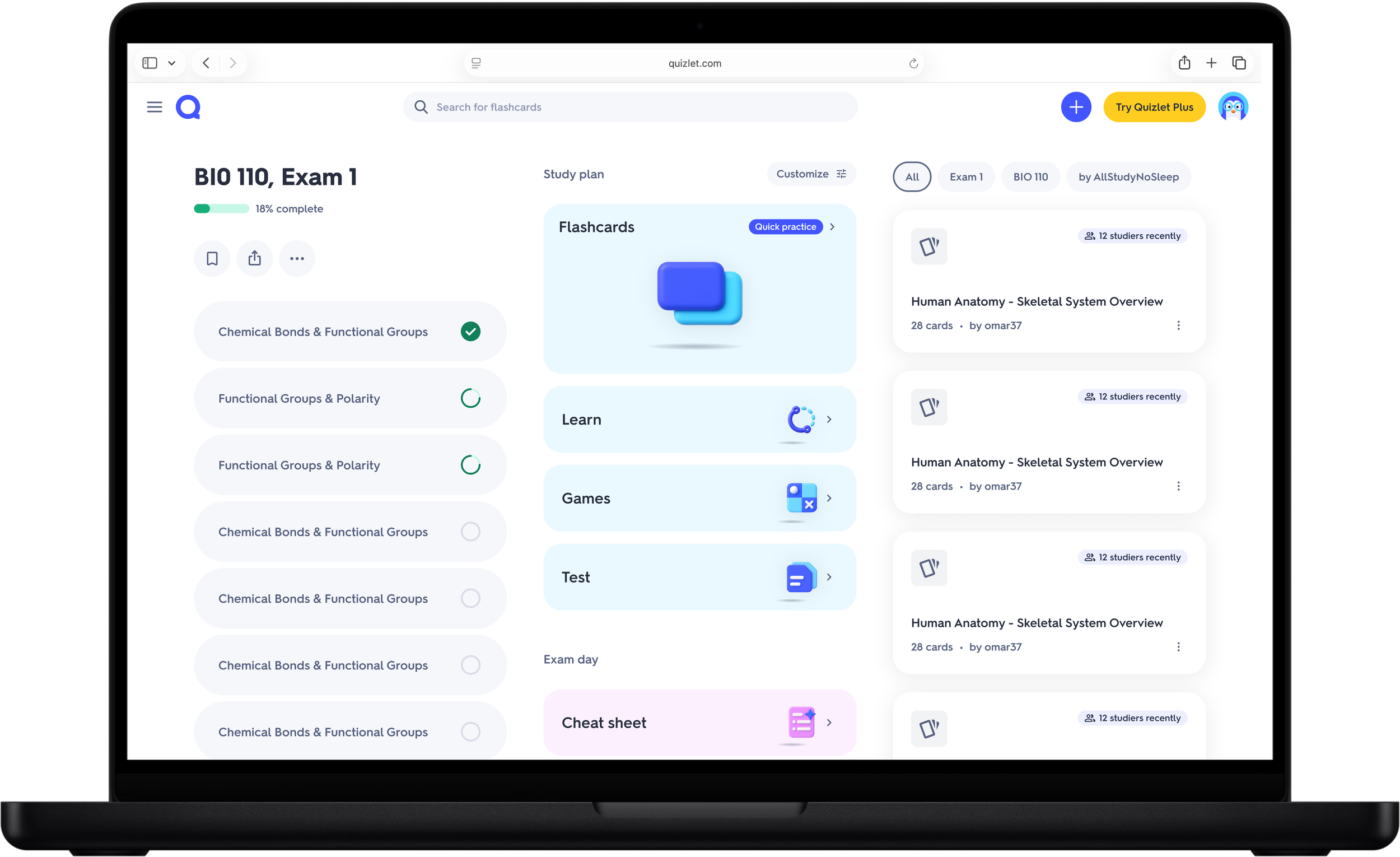
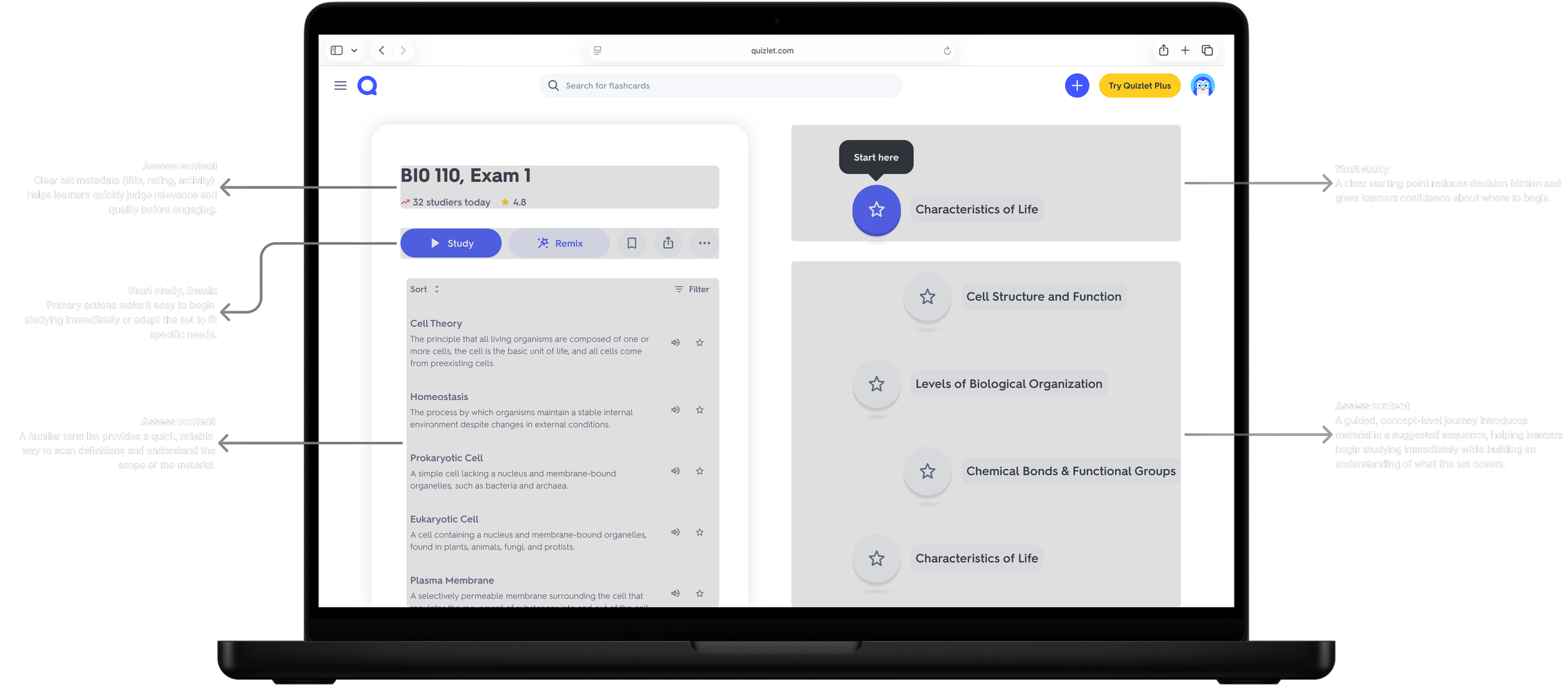
Each concept made a different bet about the page's primary job. Preview leaned on a familiar layout with study preview front and center. 3 Panel surfaced content structure and a guided study plan alongside alternative sets. 3 Panel + AI added a chat surface to the same 3-panel skeleton. Journey dropped the upfront choice of study mode in favor of a linear path. List changed the mental model of the set page, reframing it as a list mode leaning into content density and advanced filtering
Diverging: Five Directions
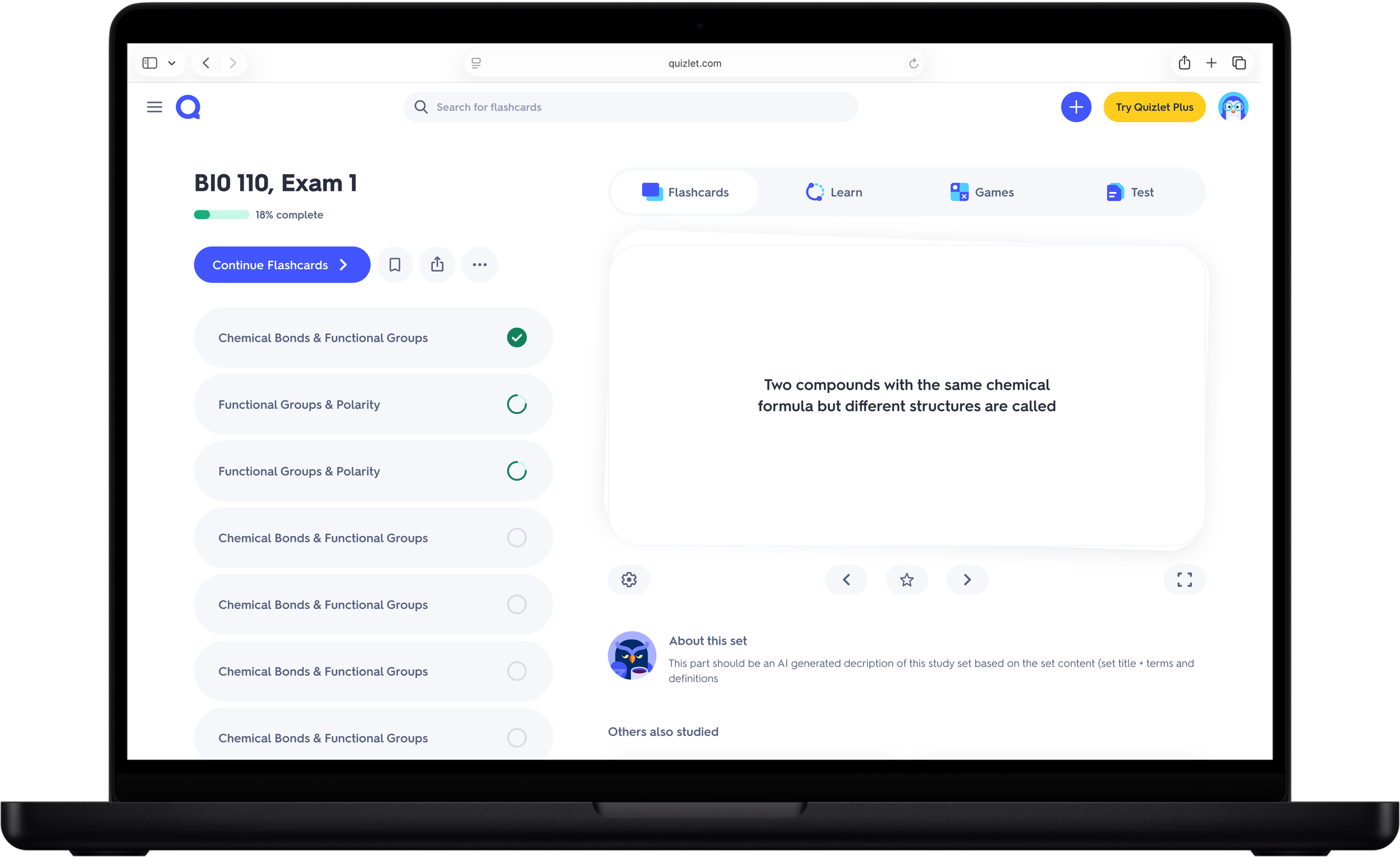
Preview: Study preview front and center
3 Panel: Study plan and recs side by side
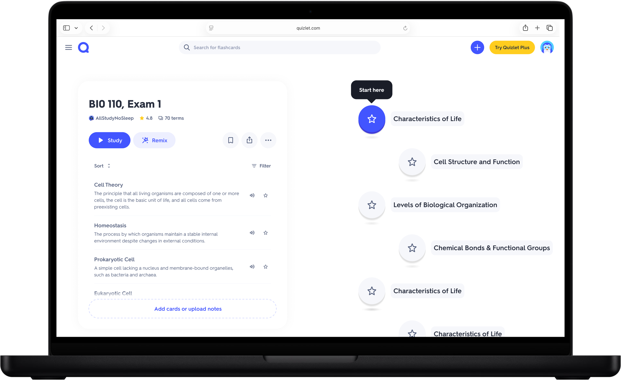
Journey: Linear, content-first path
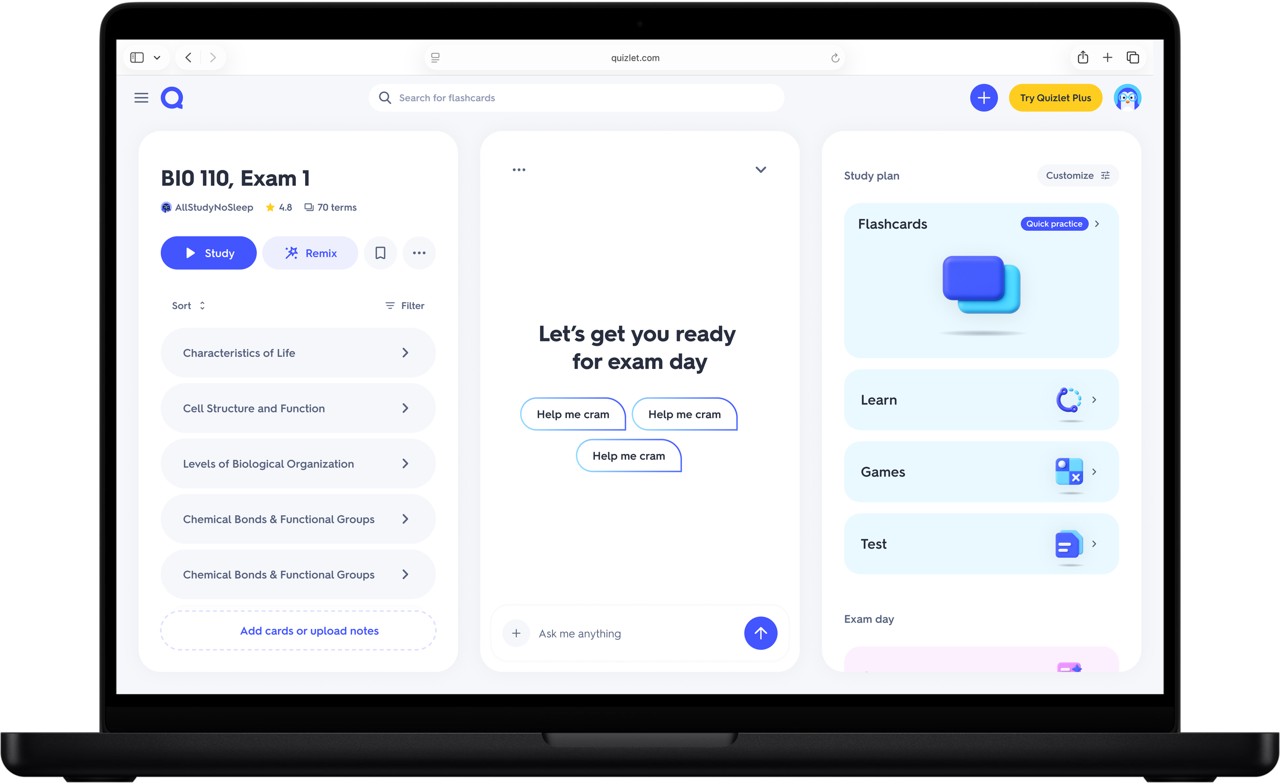
3 Panel + AI: Same skeleton, AI chat surface
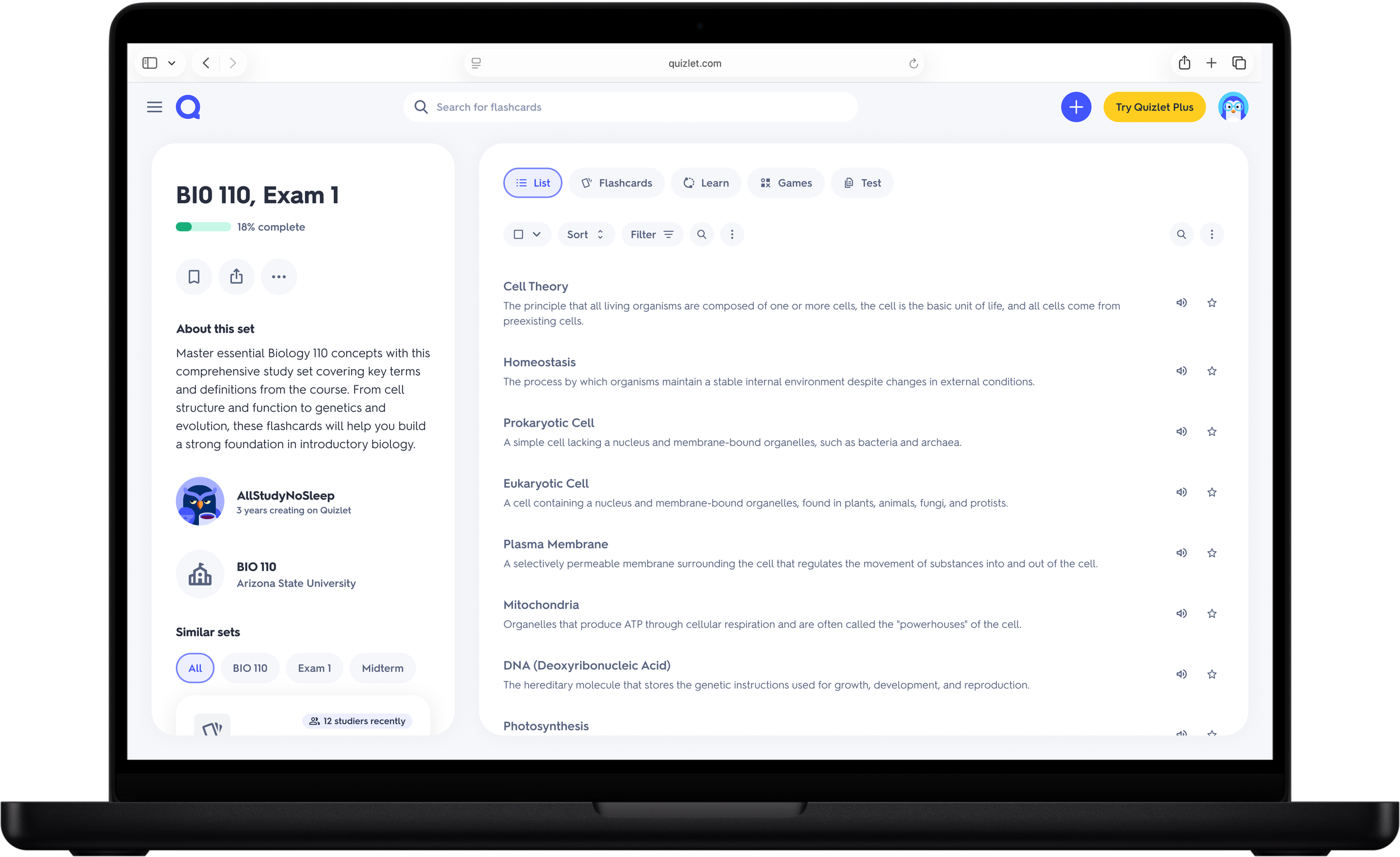
List: Dense, info-rich layout
Narrowing to Three, with Explicit Hypotheses
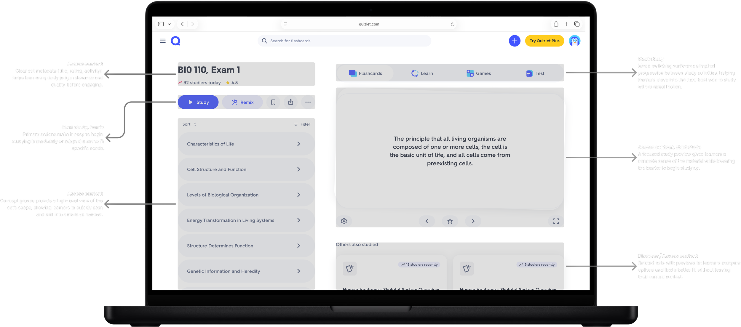
3 Panel: We believe presenting content structure, a guided study plan, and alternative sets together in a 3-panel layout helps learners assess what's in a set, choose how to study, and discover something else that fits their needs.
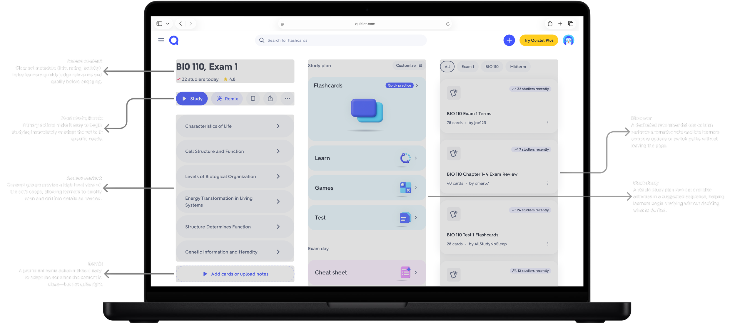
Journey: We believe guiding learners through a linear journey that puts content front and center, without requiring them to choose a study activity upfront, reduces decision friction and helps them begin studying immediately.
Preview: We believe evolving the existing set page, using study preview as a familiar entry point paired with clear access to other study modes, helps learners quickly assess what a set contains and whether it's useful, supporting confident decisions to begin studying.
Validating with Users
Preview
Clear winner

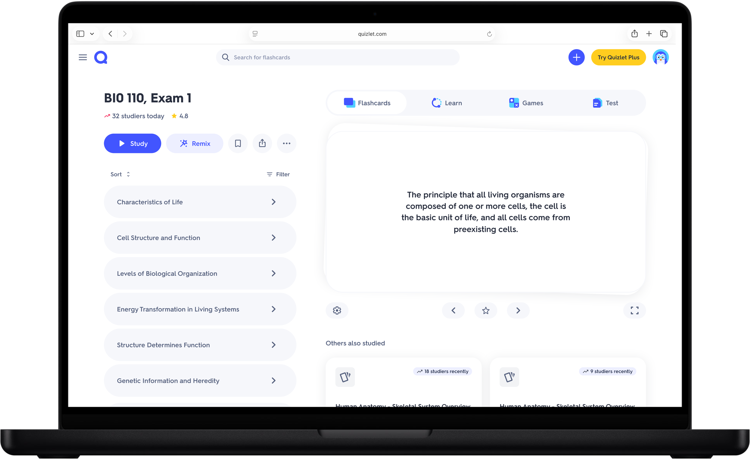
7 of 9 students picked it as their favorite, describing it as familiar but elevated
Some students worried the elevated design would lose the current terms list feel they already valued
Metadata (studiers, ratings, creator stats) was a strong secondary signal for assessing a set
3 Panel
Split the room

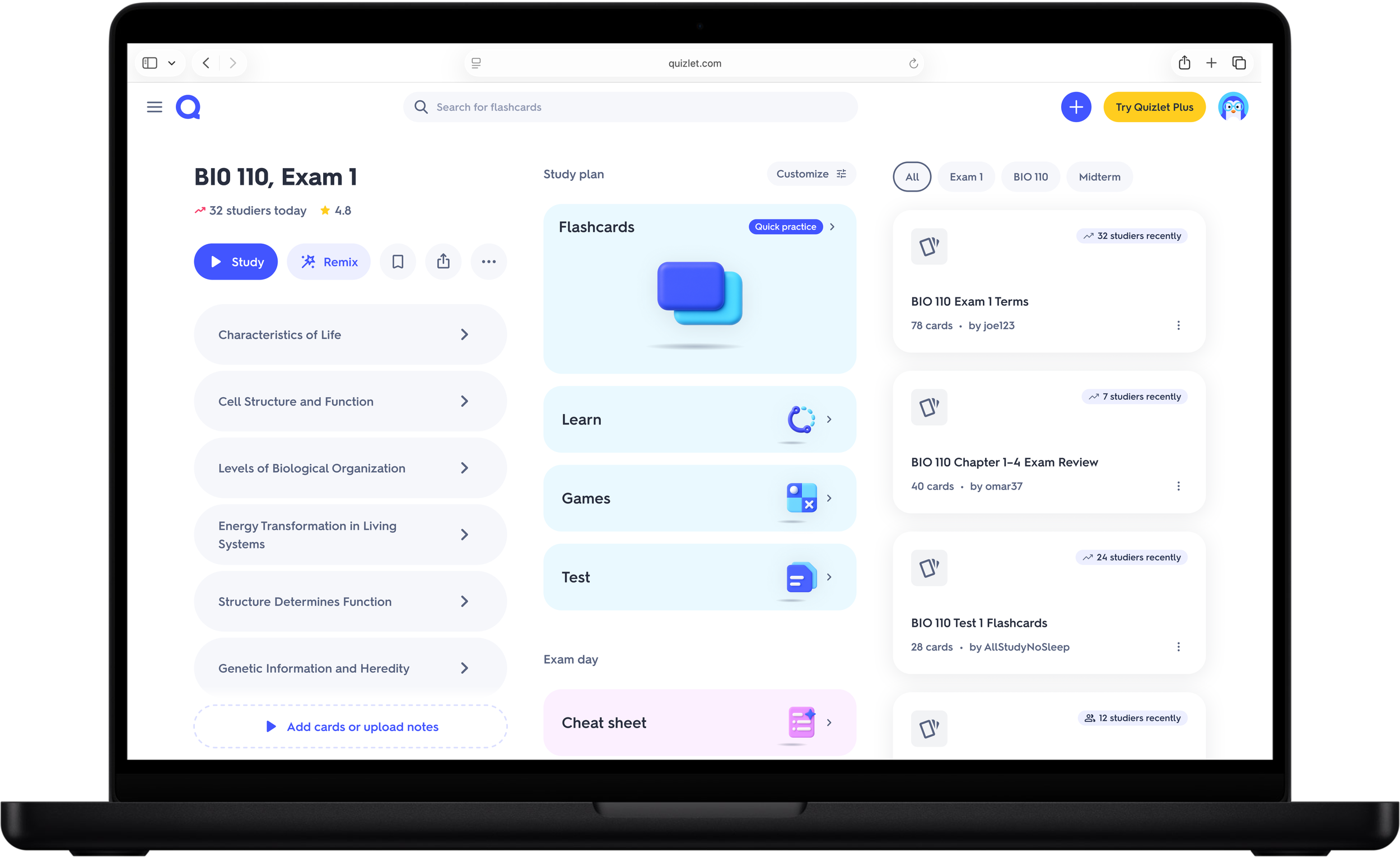
Several students compared it to Duolingo; most found the gamified framing too “elementary school”
Concept-first start reduced decision fatigue for some, but most preferred starting with study mode
Most confusing option for the assess job, despite terms list being the default view
Journey
Weakest performer

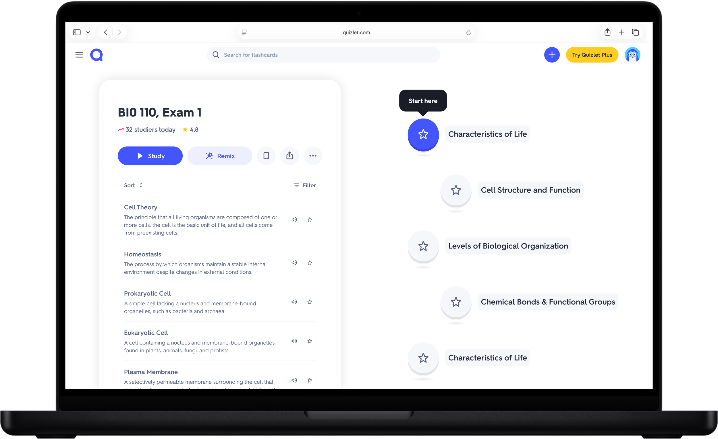
One student loved it, comparing it to her NotebookLM study podcast habit
Most found the layout overwhelming; strong pushback on the Recommendations panel's size
Some liked the study plan concept and wanted cheat sheet and video elements folded in elsewhere
Elevating the Terms List and Study Sequence
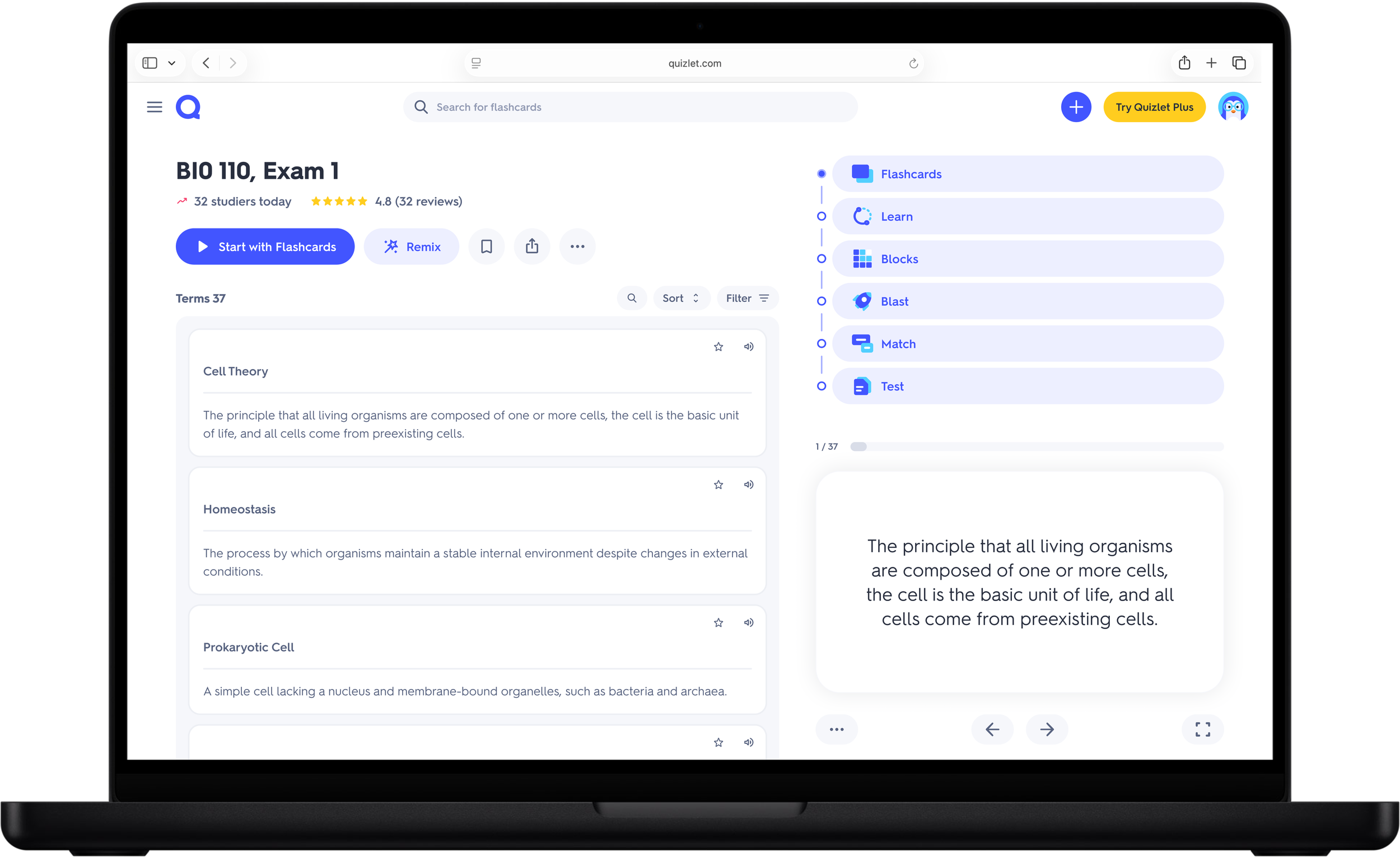
Research showed the terms list mattered most for the assess job. We scoped three hypotheses: elevating editing, elevating the terms list alone, and pairing it with a visible study sequence. All three were built before the project was shelved, with no results to report.
Additional Explorations: Concept-Level Organization
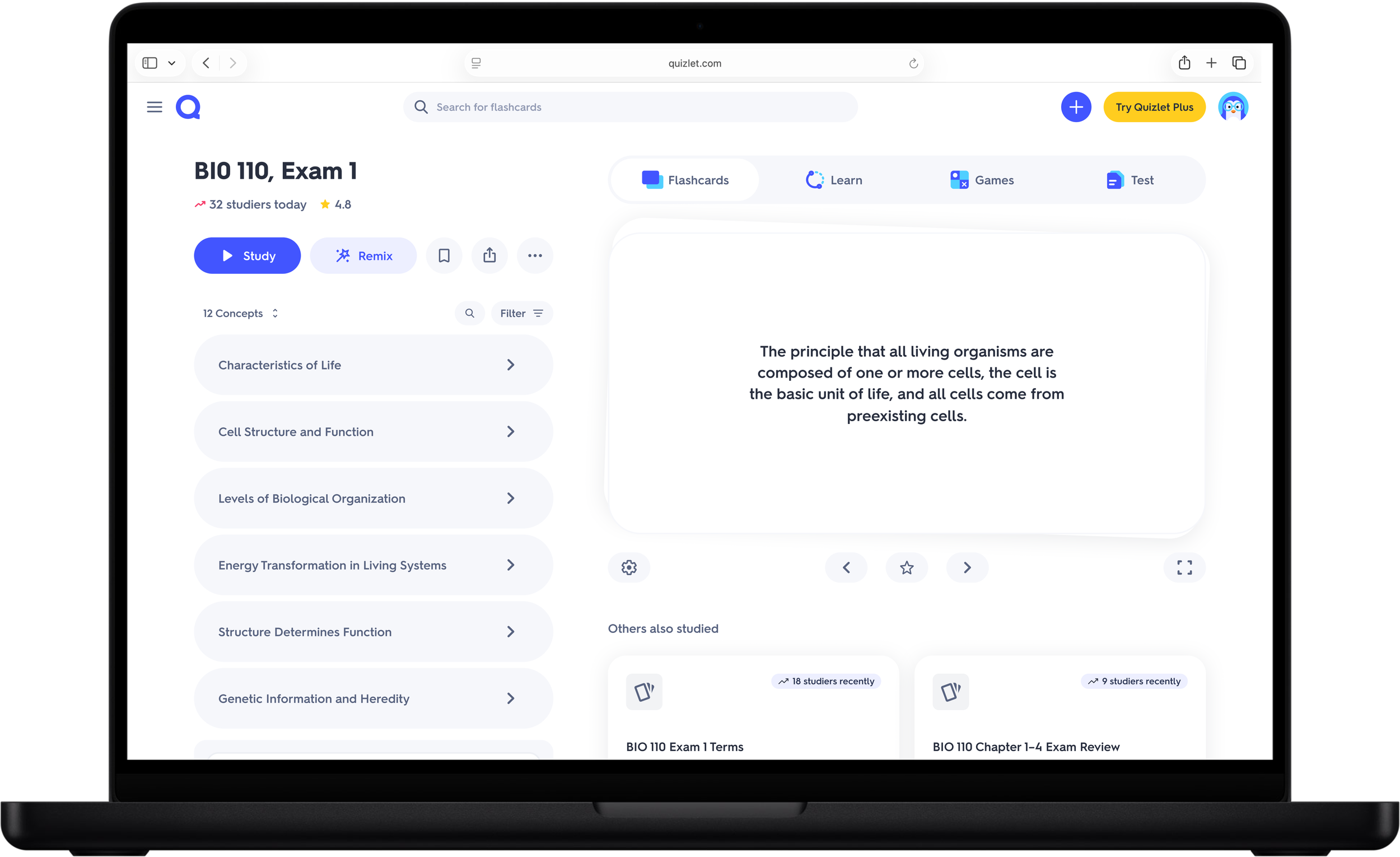
Concept-level organization was a top concept early on but didn't make the cut. I stayed bullish on it, prototyping a set and study experience organized around concepts, giving learners a high-level view while letting them drill into terms, with progress carrying across the set page and study modes.
Vibe-coding across eight variants
Tooling & Enablement
This project leaned heavily on AI-assisted prototyping to move fast without sacrificing design breadth. I built and iterated across eight prototype variants in Cursor, using Claude to generate component code and Figma for quick mockups and design system reference. The Assembly design system sped this up: I pulled design tokens directly and pasted live components into Cursor via the Figma MCP integration, rather than hand-building UI for every direction.
I also built lightweight import tooling so research participants could bring their own study content instead of reacting to a generic set. Testing with real course material, not placeholder content, mattered: reactions to a concept map or study plan read differently when the material is something a student actually needs to learn.
Execution Highlights

Eight prototype variants built and iterated end to end in Cursor, using Claude to generate and adjust component code
Design tokens and components pulled from Figma into Cursor via Figma MCP, using Assembly
Custom import tooling let research participants test with their own real study content instead of a generic set
Design-led narrowing from five concepts to three, tested qualitatively before scoping isolated A/B hypotheses
Validated direction, no live results
Impact
5
vibe-coded end to end prototype variants
100%
of testing used real student content
7/9
preferred Preview variant in testing
3
A/B hypotheses scoped and ready to launch
The project didn't ship, so there's no live A/B data to report. Here's what we do have:
Validated Preview as a clear directional winner: 7 of 9 students preferred it in testing, with concrete feedback to retain metadata and keep the terms list and mini-flashcards intact
Identified terms-list prominence as the highest-confidence change, shaping three scoped A/B test hypotheses
3 Panel and Journey directions underperformed for different reasons: 3 Panel felt overwhelming, while Journey was least preferred and most confusing for the assess job
Modeled, not yet realized: 14% goal (8% annualized) lift in activation, and 22% goal (19% annualized) lift in avg. days studied
Quant test variants and success metrics were fully scoped and ready to launch across three hypotheses
Reflection
What I'd do differently
I wish we'd gotten to test concept-level organization, a later exploration into grouping the set and study experience around concepts instead of a flat term list. It drew some of the most positive qualitative reactions of the whole project, students responded to seeing their progress in the context of a bigger learning goal, not just a flat list of cards, and I regret not prioritizing it sooner.
More broadly, this project is a real example of solid process, clear jobs, converging research and design, quant tests ready to go, running into a business reality that had nothing to do with the work itself. The project was shelved early in the year as another initiative was prioritized for back-to-school season.