Assembly Design System
Building Quizlet's first production-grade design system from a 20% passion project into a multi-platform foundation that lets designers and engineers ship faster across web, iOS, and Android.
Quizlet
Company
Lead Designer, Design Systems PM
Role
Web, iOS, Android
Platforms
3 Engineers, 5 Designers, 1 Animator
Team size (peak)
Overview
A system built from the ground up
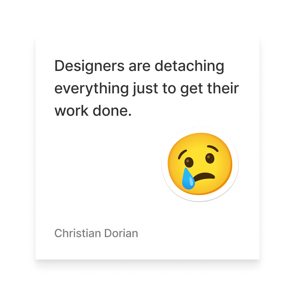
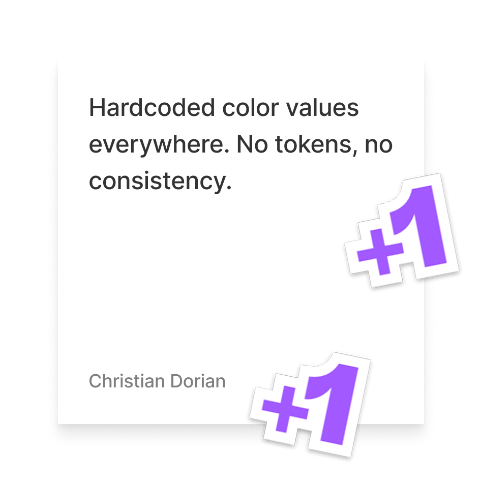
When I started pushing for Assembly, Quizlet had no true token system, minimal documentation, and no shared naming conventions. Designers were detaching components. Engineers were guessing at color values. Every new feature introduced more visual drift.
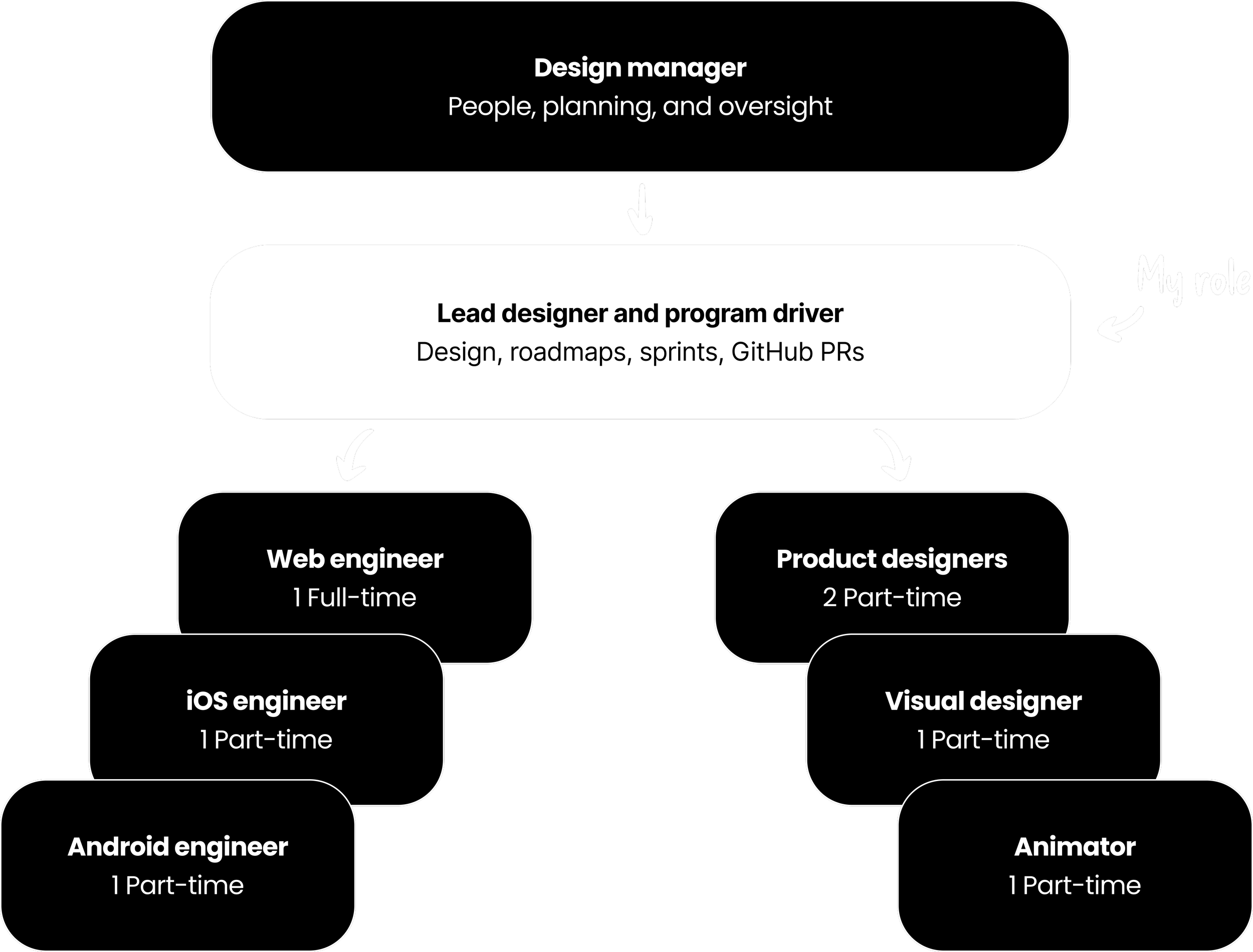
What started as a 20% time project earned full leadership buy-in. I drove the roadmap, sprint planning, and investment decisions while also doing the design work itself, including making pull requests in GitHub for token changes. A design manager provided people management and organizational oversight; I owned the direction and execution.
3
Platforms shipped
2
Product rebrands
9
Team members at peak
4/5
Efficiency score 2025 survey
Context & Problem
The state of things before Assembly
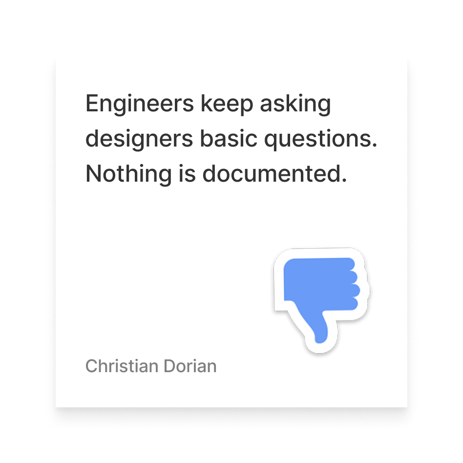
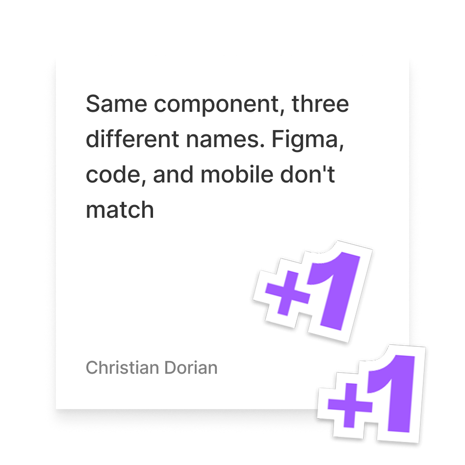
Quizlet's product had grown fast and the design foundation hadn't kept pace. Components existed but weren't documented. Token naming was inconsistent or nonexistent. There was no clear process for how design decisions translated into production code, and that gap was especially painful across platforms.
By 2025, a cross-functional survey of 26 team members showed 73% used Assembly regularly, a significant shift from the earlier state of no shared components or tooling.
Key Pain Points
Approach
Making the case, building the team
I built the business case, framing it around engineering velocity, designer productivity, and the cost of design debt. Leadership approved headcount for one full-time web engineer and two part-time native engineers. Over time, that grew into three full-time engineers, one per platform, alongside a design manager, four part-time product designers, and an animator.
I drove roadmap and sprint planning informally but consistently, keeping the team focused across three phases: foundational token architecture, the component library, and cross-platform tooling and engineering enablement. Tokens came first, since they were needed for consistency, scalability, and cross-platform parity. The second rebrand's color system fragility later confirmed the need, since a token system would make future rebrands far easier.
Assembly Team Org Chart
Design Work ∙ Tokens
Architecting the token system
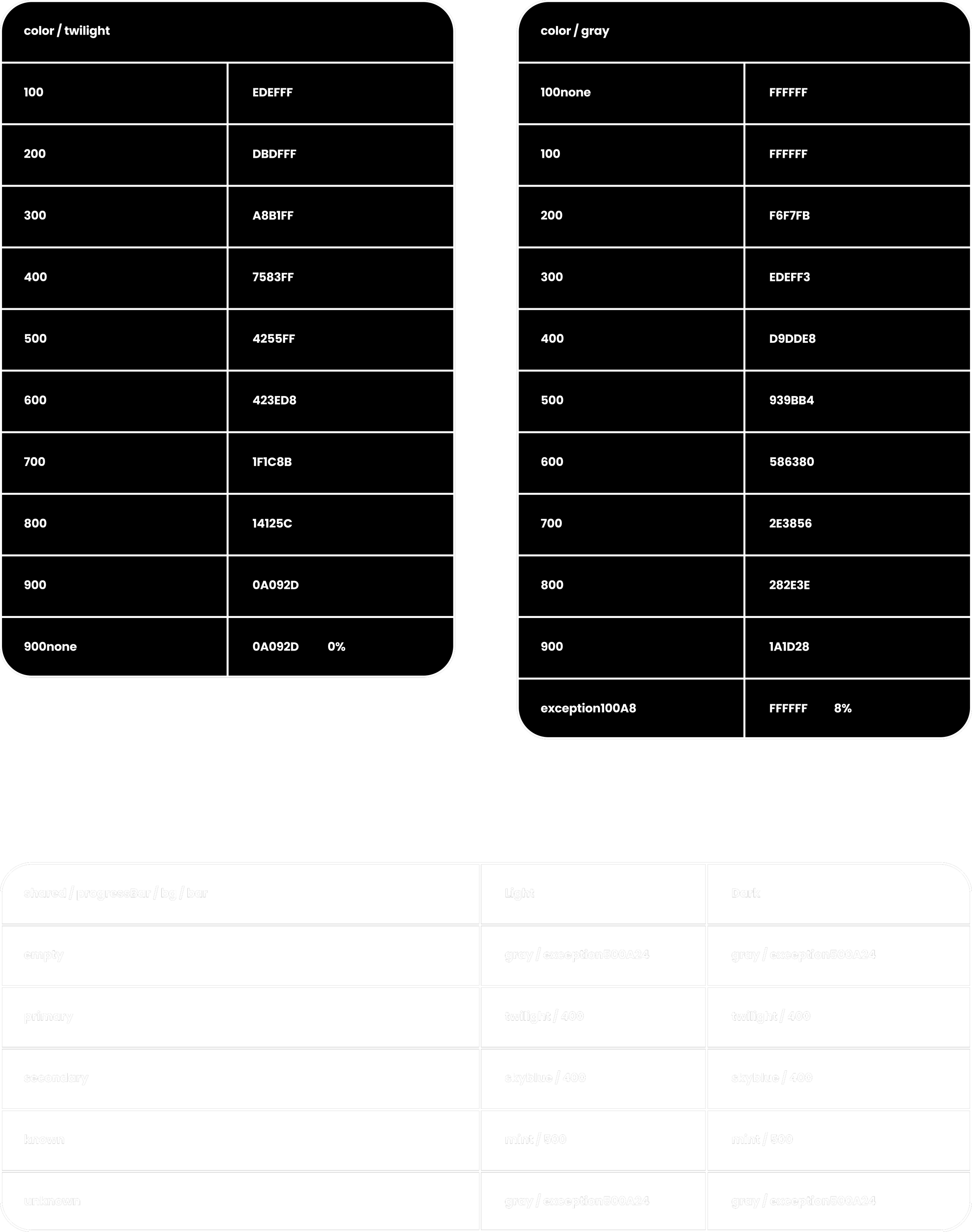
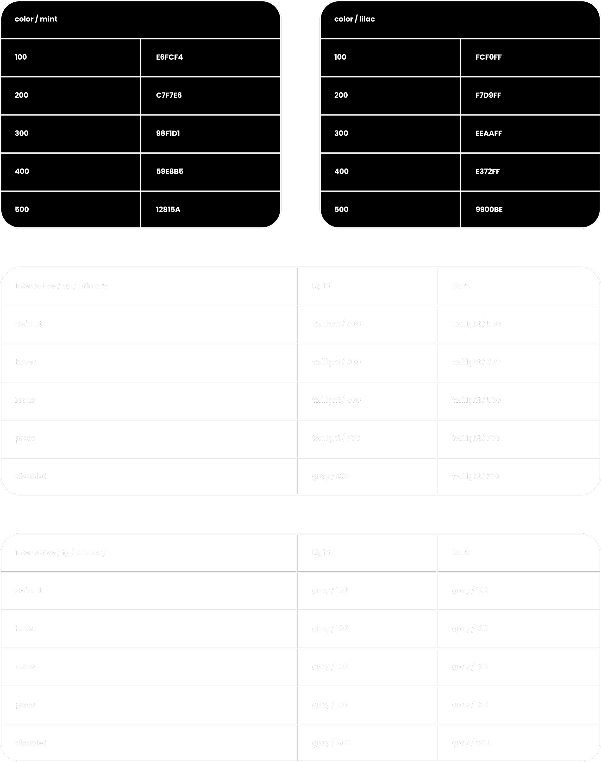
I structured tokens into three tiers: reference, system, and component. Reference tokens hold raw values. System tokens map those to semantic roles, like interactive/bg/primary, with light and dark values. Component tokens scope to specific UI contexts. With 182 ref, 142 sys, and 75 comp tokens at launch, this structure established naming conventions and patterns that scaled across platforms and became the foundation new components were built on.
Assembly Variables
Token Pipeline ∙ Figma to Production
1
Figma Variables live across ref, sys, and comp collections
2
Figma plugin exports tokens as JSON, kicking off the pipeline to production
3
A GitHub pull request commits the JSON to the shared repo
4
Token changes propagate to web, iOS, and Android production builds
5
Designers drive token changes, engineers review and approve
A token change in Figma became a pull request, reviewed and merged by engineers across all three platforms. It gave designers real agency over product polish.
Design Work ∙ Component Library
A full component library, documented and live
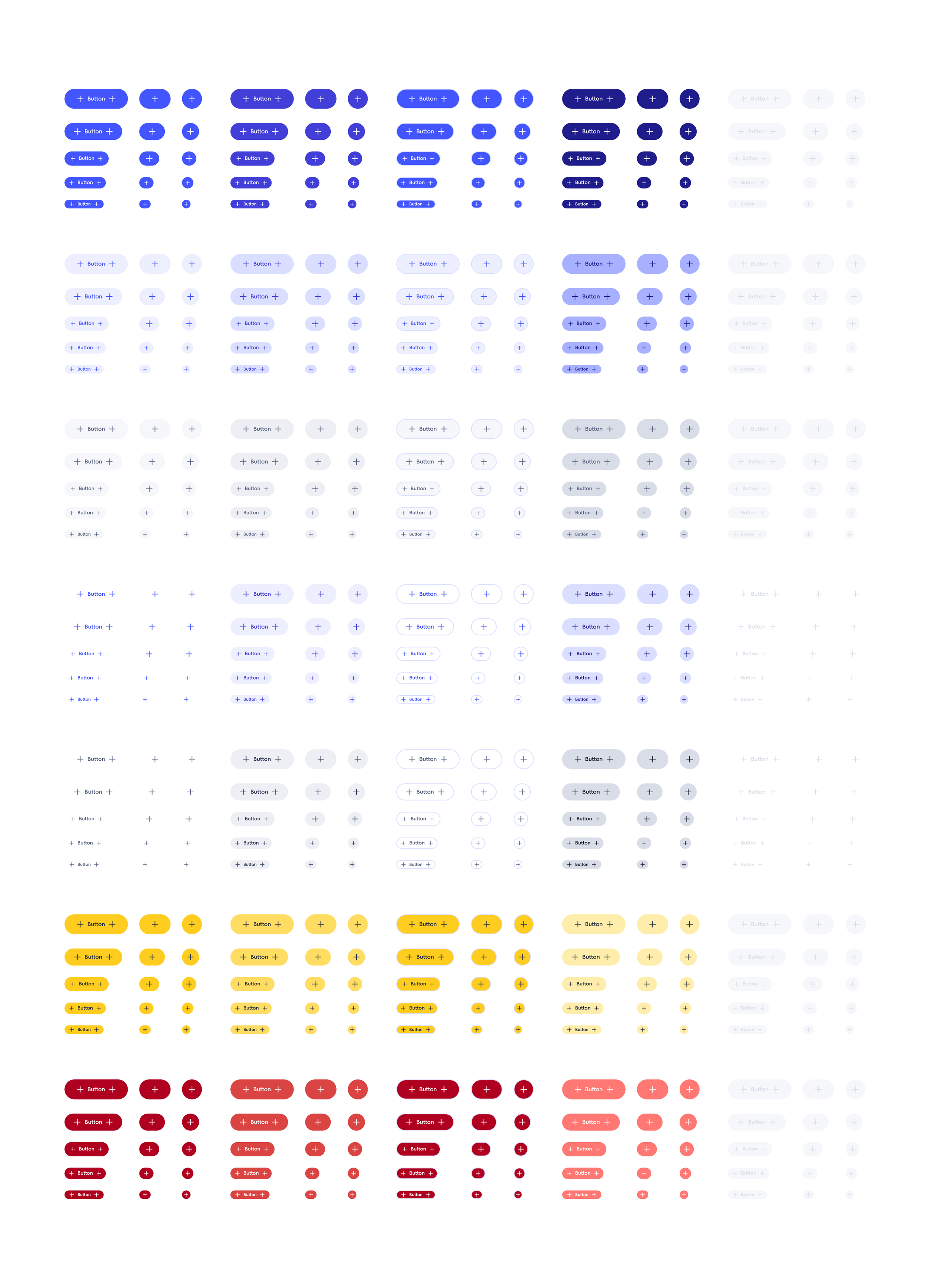
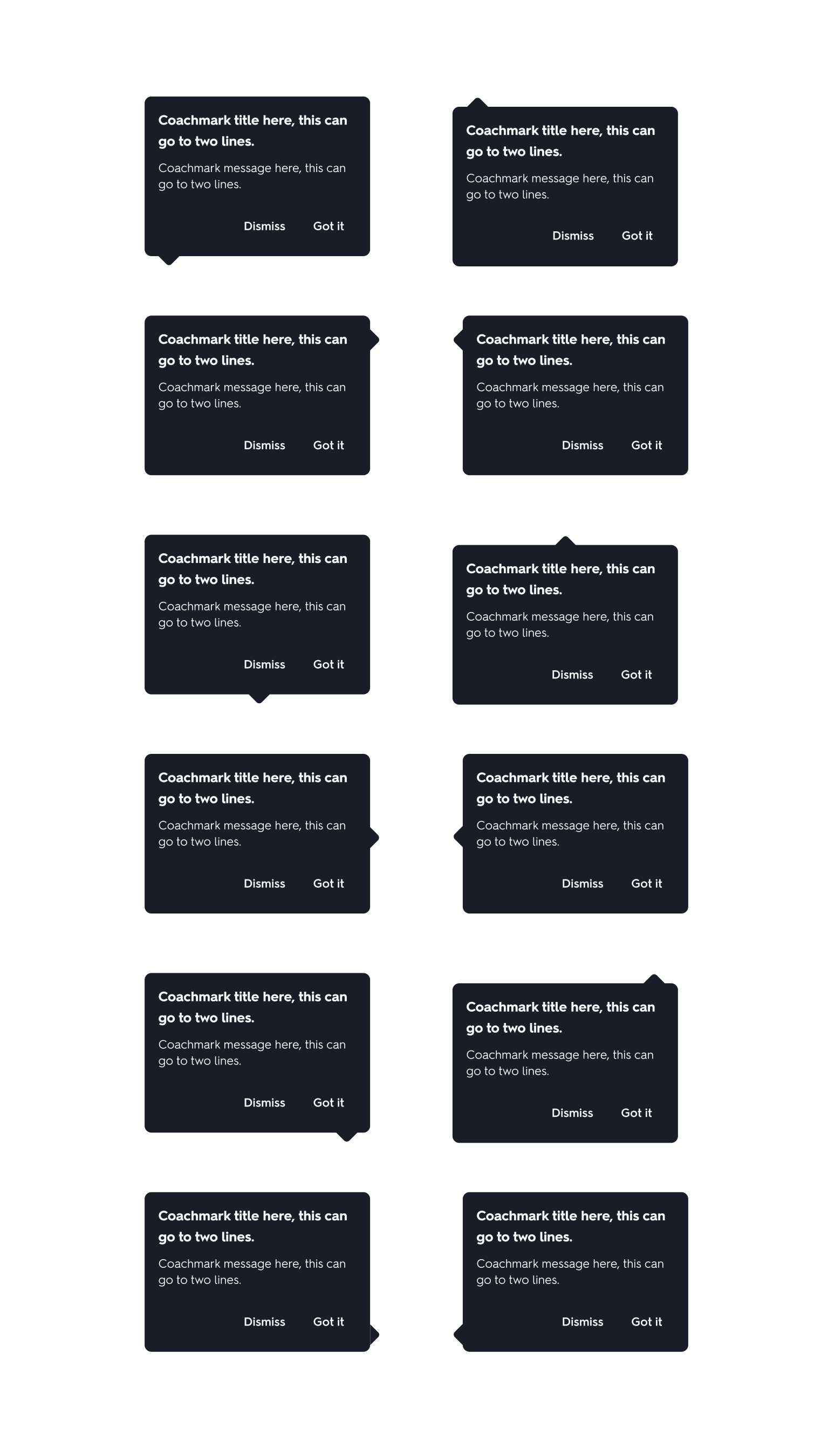
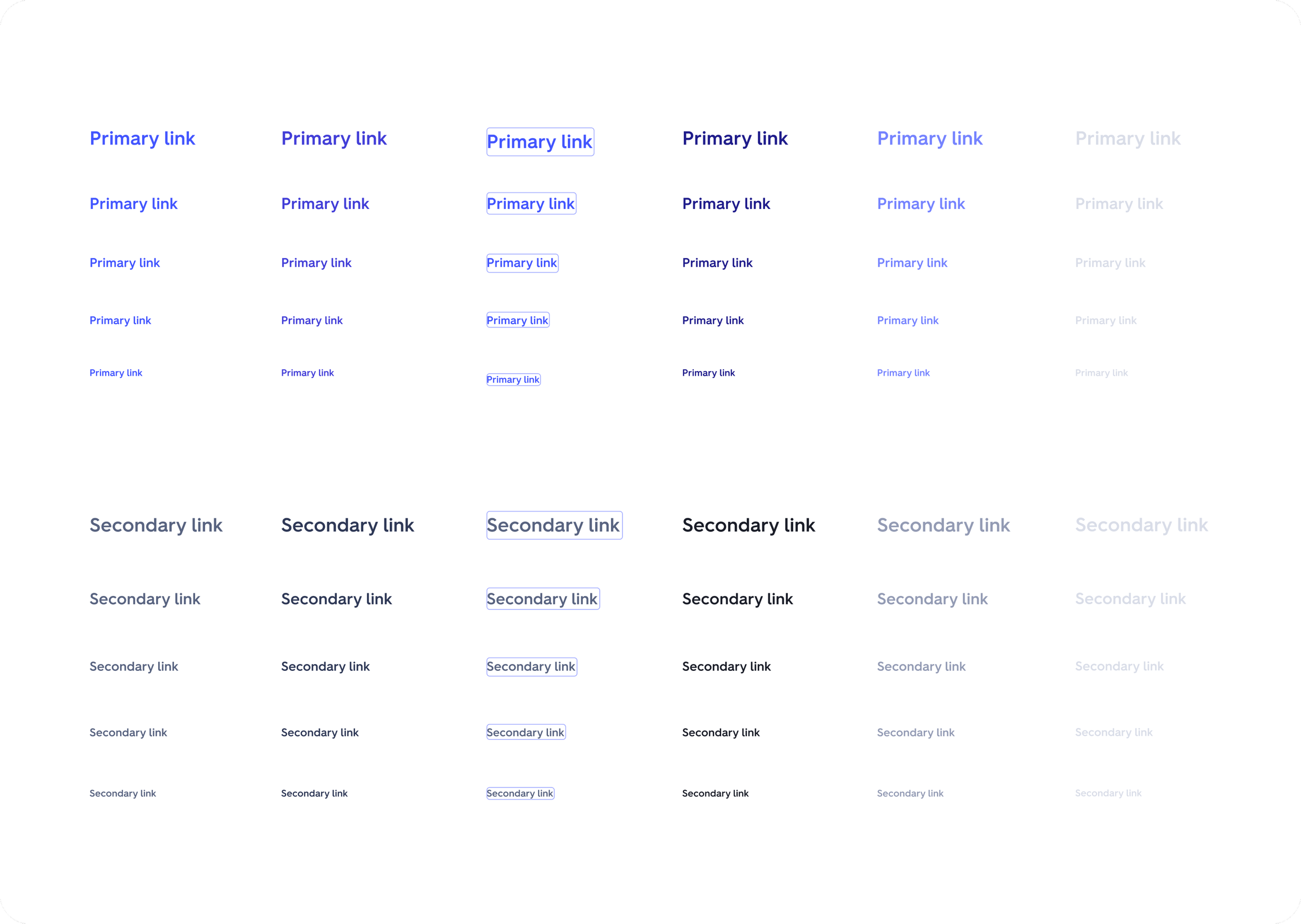
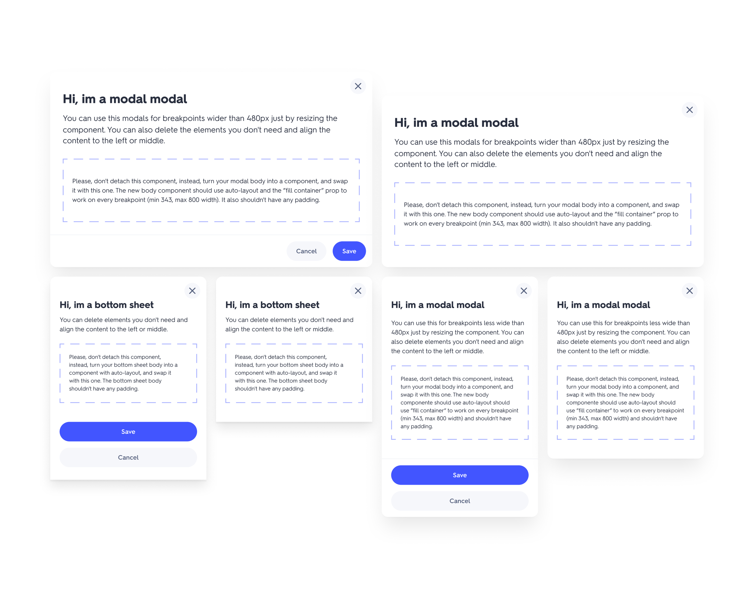
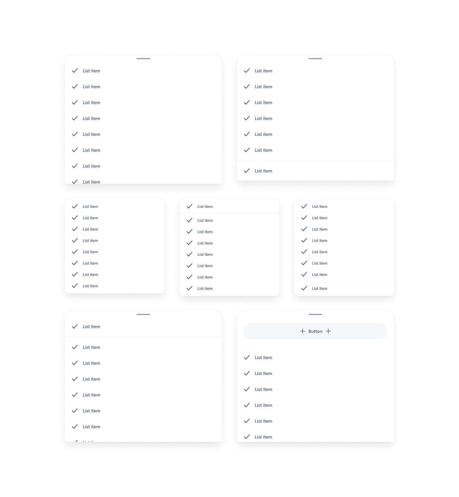
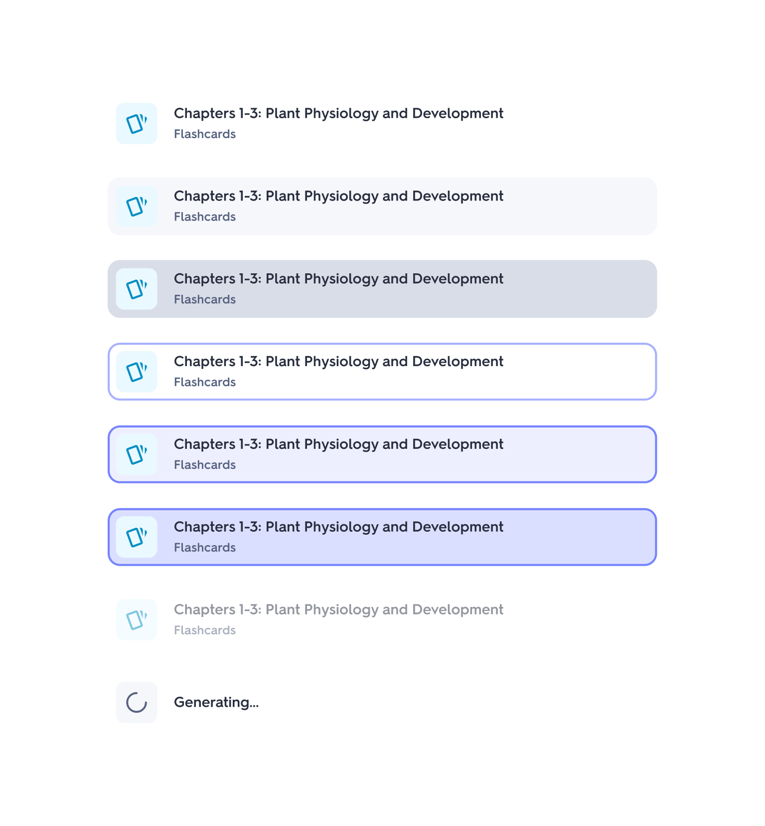
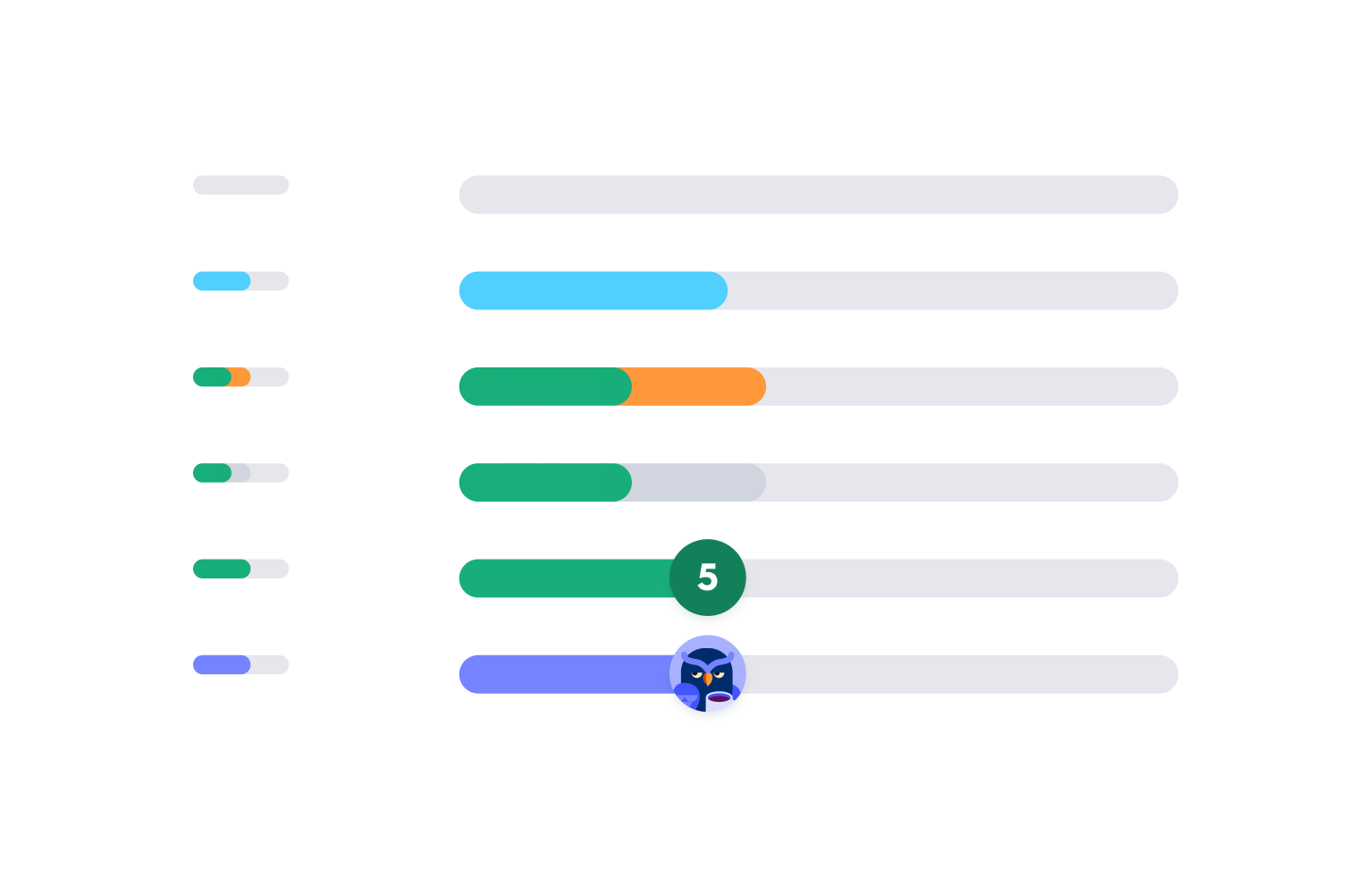
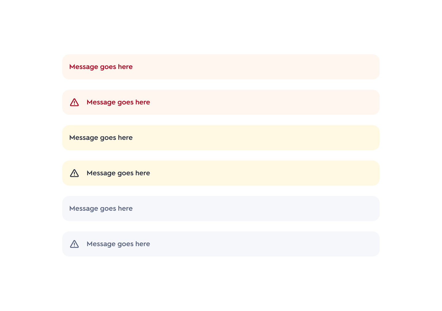
Every component in the Assembly Figma library ships with anatomy diagrams, size variants, interaction states, do/don't guidance, and platform availability indicators. Links to Storybook are included directly for engineering reference.
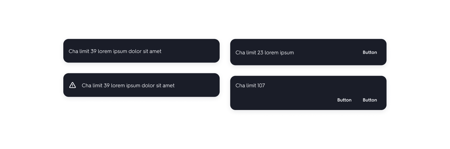
The library ranges from atoms like buttons, links, and radio buttons to more complex molecules like modals, toasts, coachmarks, and content list items.
Design Work ∙ Foundations
Icons, avatars, and the full foundation layer
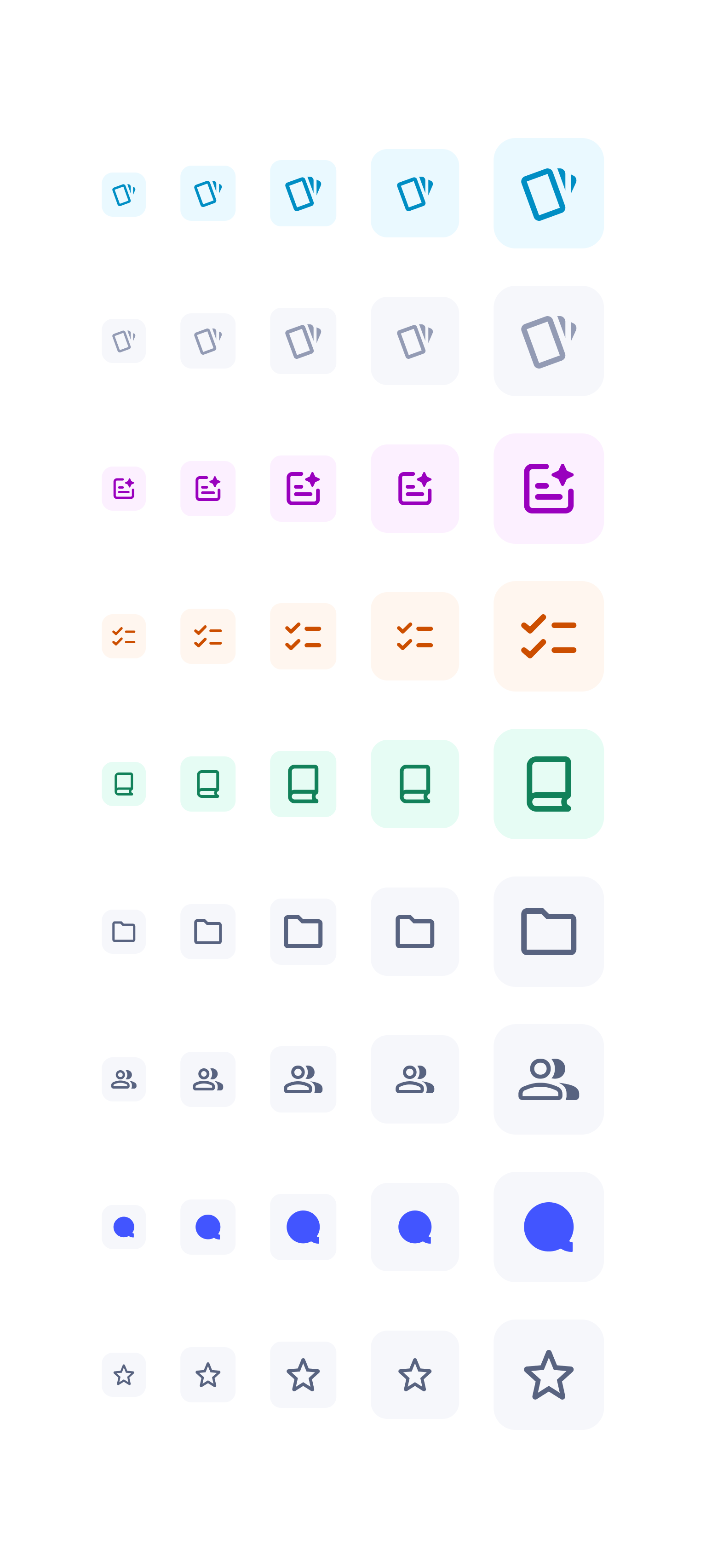
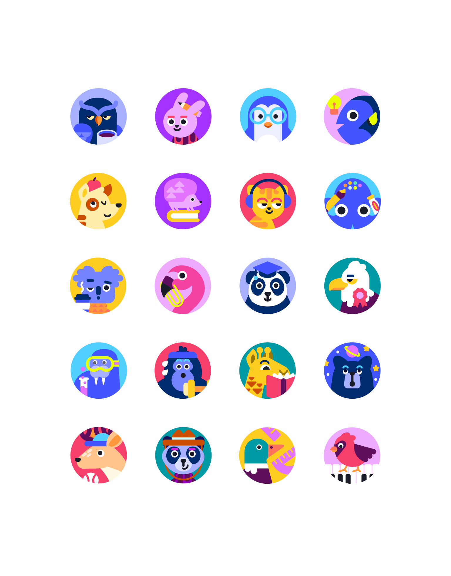
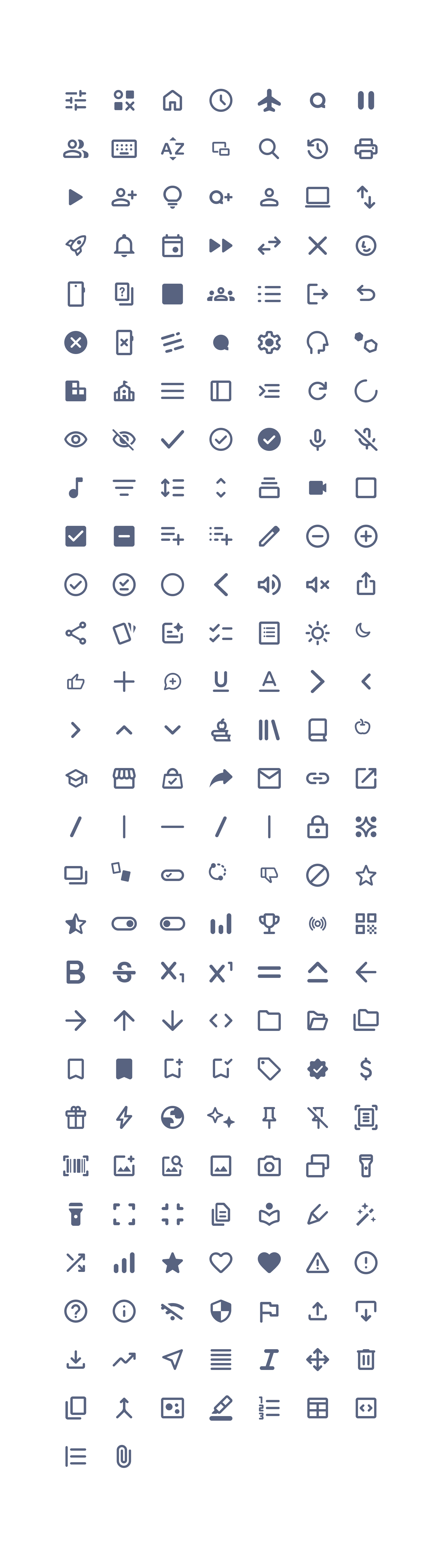
Assembly needed a complete foundation beneath the component library: a categorized set of brand and system icons, a full typographic scale, a color system built for light/dark mode, and a set of illustrated character avatars.
Rebrands
Shipping rebrands at scale
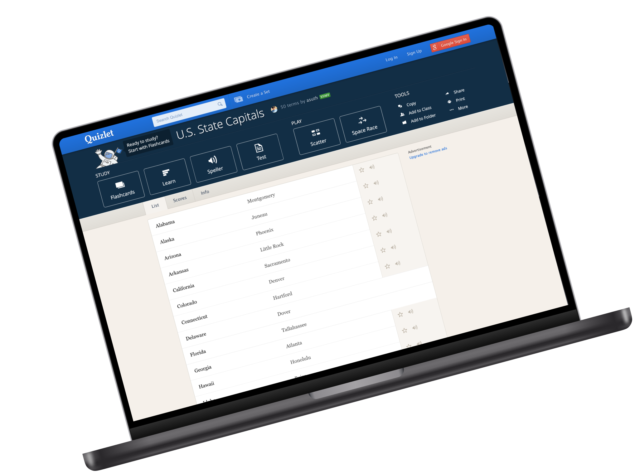
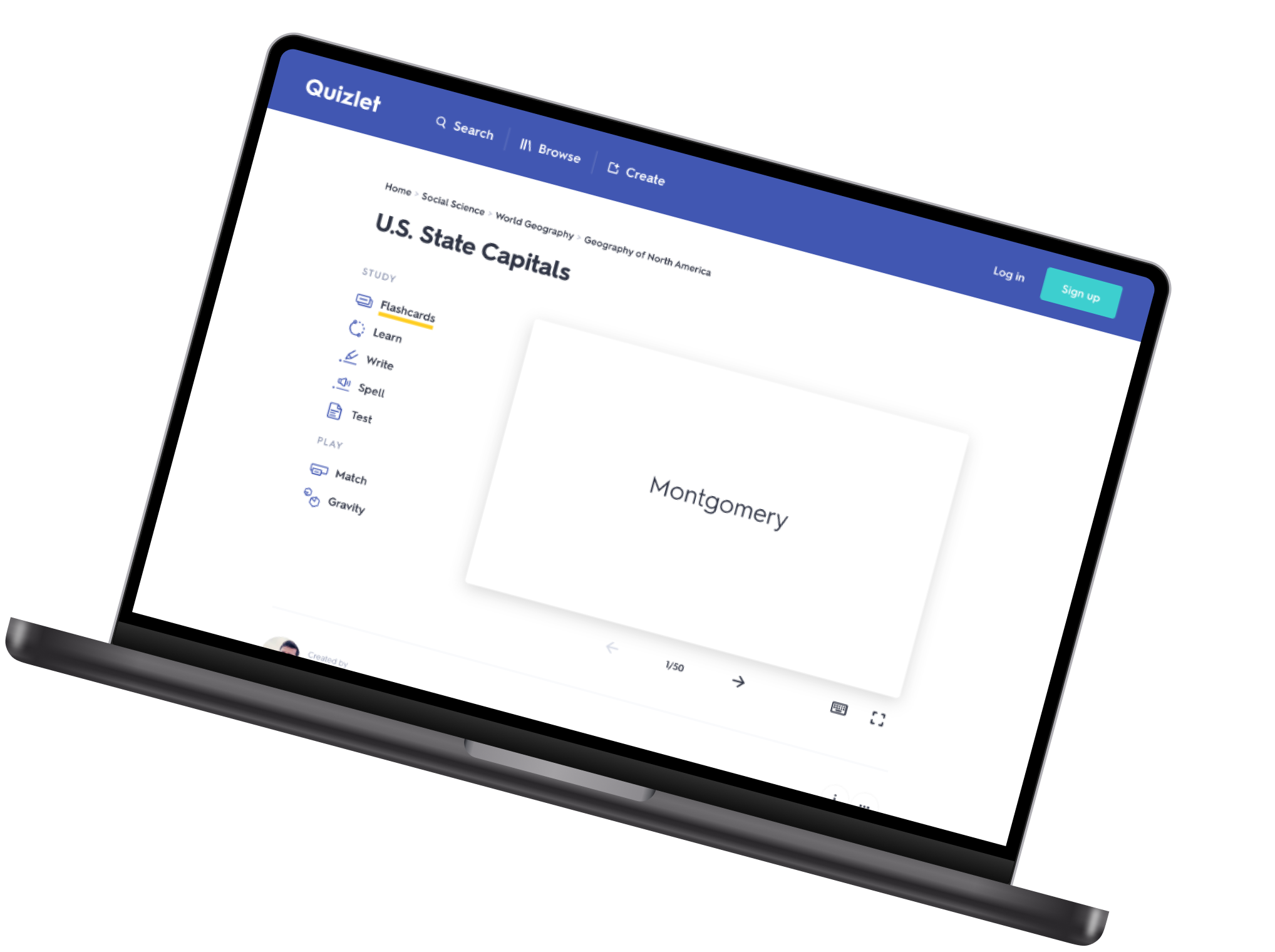
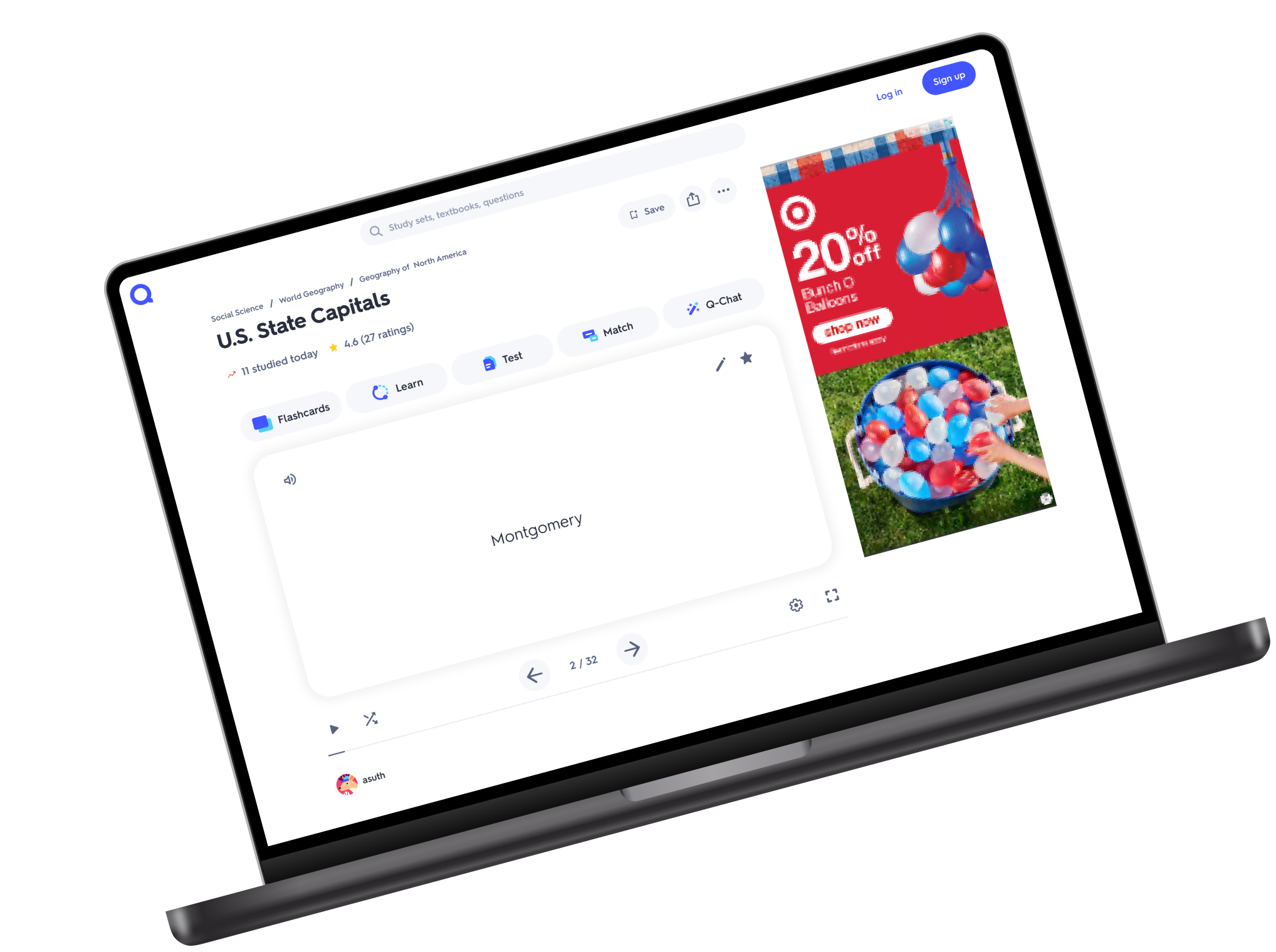
Quizlet went through two rebrands during this work. The first was a full product rebrand I designed and shipped as v1 of the system. The second was lighter-touch but revealed fragility in the color system, which reinforced the need for the token architecture that followed.
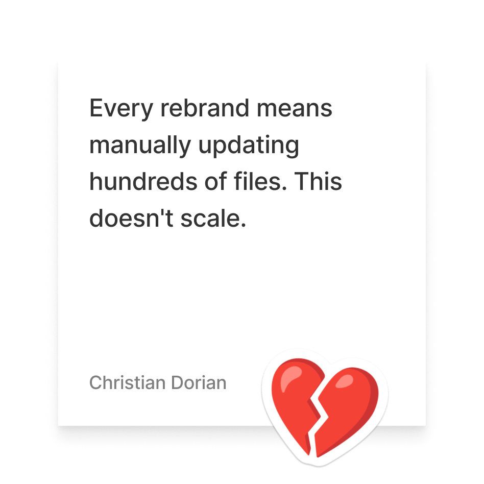
With tokens in place, a single rebrand decision could propagate across all three platforms at once. What used to require manually updating hundreds of Figma files became a token update and a pull request.
Tooling & Enablement
Closing the loop between design and engineering
A design system is only as good as the workflows around it. Assembly included Storybook integration, Code Connect, and Dev Mode in Figma for engineering inspection, and documentation quality standards built directly into the Assembly Figma library that made self-service the default.
I also designed and published a LinkedIn Learning course on Figma fundamentals for engineers, covering Dev Mode, Code Connect, and Storybook. Between Figma, Storybook, and the course itself, engineers had multiple self-service paths into the system, reducing how often they needed to interrupt designers with basic questions.
Tooling & Process Highlights

Confluence space: usage guidelines, best practices, do's and don'ts, and links to related components

Storybook integration: component pages link directly to live Storybook stories for engineering reference

Code Connect + Dev Mode: engineers inspect real component props in Figma without asking designers

Token pipeline: JSON export from Figma to GitHub PR to multi-platform production

LinkedIn Learning course: self-paced Figma + Assembly onboarding for engineers

Assembly Slack channels: announcements, best practices, and real-time troubleshooting
Impact
What Assembly made possible
Rebrands that once took months of manual effort could now roll out in days. Handoff became more predictable, and designers could drive token changes to production across all three platforms with engineers staying in the loop for review.
A 2025 survey of 26 cross-functional team members gave Assembly a 4/5 on efficiency, component discoverability in Figma, and confidence in selecting the right token. 73% used the system regularly and 77% wanted to contribute back to it.
Key Outcomes

Full token system across ref, sys, and comp layers on web, iOS, and Android
Complete Figma library with anatomy docs, variants, and Storybook links across all three platforms
Full foundation layer: icon library, illustration system, type scale, color system, and avatar component
Two product rebrands at scale with significantly reduced manual effort
Designer-driven token pipeline: color changes driven by design, reviewed and shipped with engineering
77% of survey respondents interested in contributing to Assembly
Reflection
What I'd do differently
Leading the Assembly team while also being the lead designer on another product team meant a lot of context switching. The system moved forward, but some strategic documentation fell through the cracks. More dedicated focus earlier would have helped the team scale ownership faster.
The 2025 survey flagged two known gaps: Figma-to-code parity scored 3.3/5 and ease of implementing designs in code scored 3.4/5. Both would have been the next chapter of the work. The LinkedIn Learning course was the right idea but needed more internal champions to drive adoption.